DESIGN BLOG
Thoughts
&
Musings
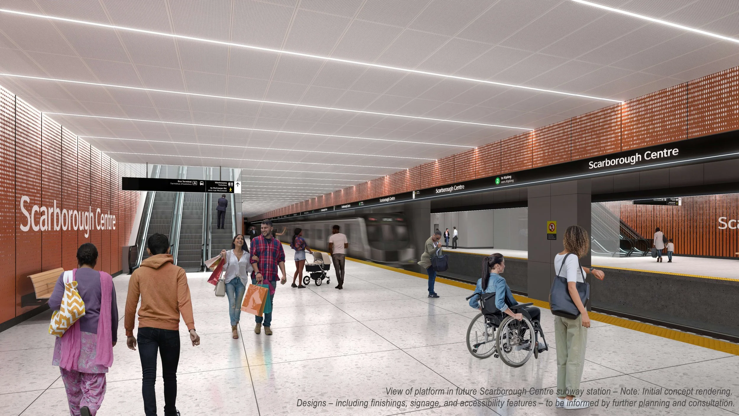
Making the System Work: Wayfinding for the Scarborough Subway Extension
By Karen Zwart Hielema
I love it when systems work well – when they are clear and efficient. With every sign that we place in a transit station, our goal is for a seamless passenger journey. Sometimes the architecture facilitates wayfinding, and a sign is not needed!
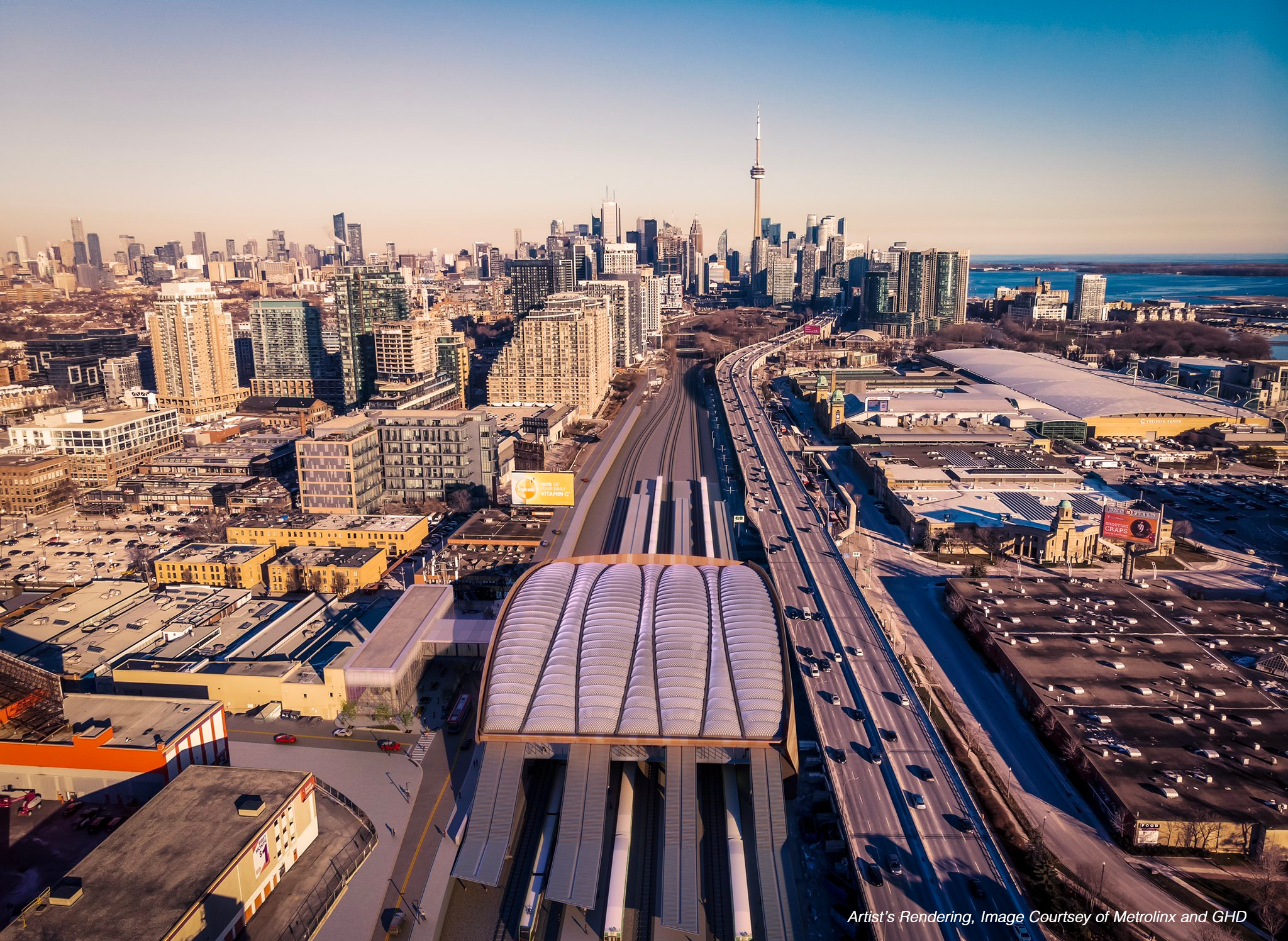
The DEXD team has been awarded a role as wayfinding and signage consultants as part of the larger delivery team for Scarborough Subway Extension. This marks our second large-scale transit project in Canada, and we’re thrilled to bring our expertise in human-centered design and intuitive wayfinding to this global team of experts including SENER, DIALOG, and GUNN.
A subway line is more than just a line—it’s a vital transportation system that stitches the fabric of a city and keeps our communities connected. The line will extend Toronto's Line 2 subway by 7.8 km, connecting with more than six transit options across the city. This expansion will replace the Scarborough RT (Line 3) and help reduce travel times while improving access to jobs, schools, and other destinations in Toronto. An image can speak a thousand words, but there are numbers that carry deep meaning. Consider the impact this line will have:
Ridership: 105,000 daily boardings
Increase in transit use: 52,000 daily
People within walking distance: 38,000
Access to jobs: 34,000
Annual reduction in greenhouse gas emissions: 10,000 tonnes
Delivering large-scale, complex projects can sometimes make it easy to lose sight of the broader importance of our work as we navigate through daily tasks, submissions, and technical reviews. But it’s important to remind ourselves that at the heart of every professional involved in a public project is a passion for doing good for the community. It’s about working toward the mission of creating collective joy and building spaces where everyone’s quality of life improves.
That’s why, with every sign we place in the subway systems, we are one step closer to fulfilling the mission of our company: creating spaces that enhance people’s lives.
Congratulations, DEXD team!
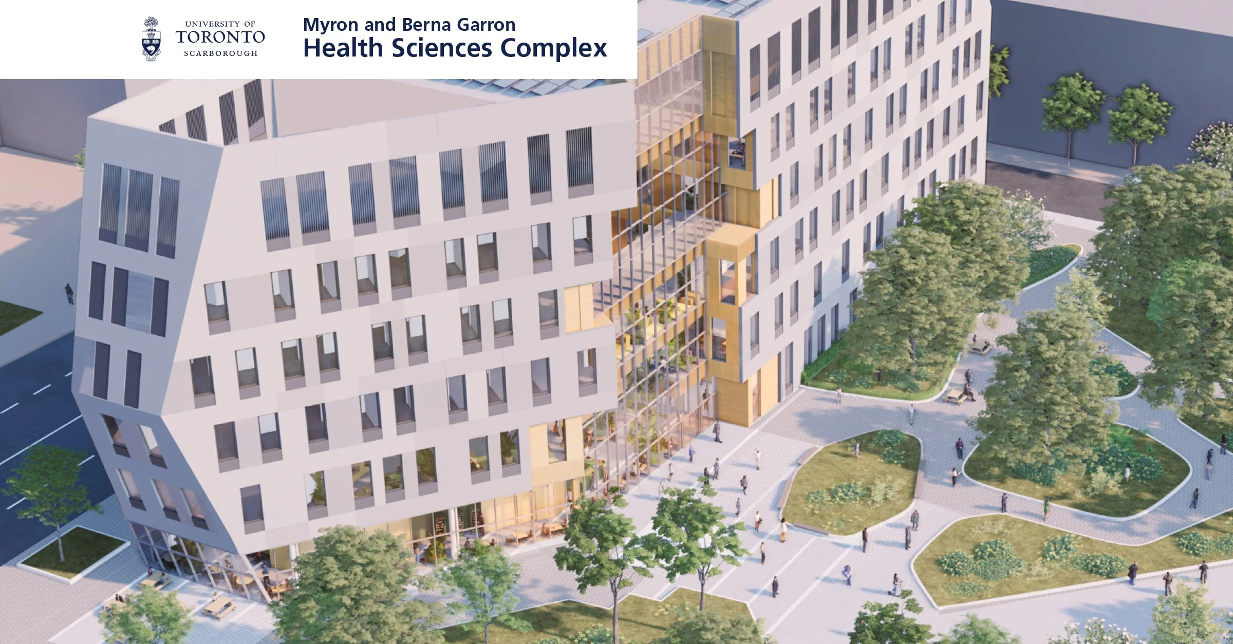
Intuitive Wayfinding Design at University of Toronto Scarborough: MBG Health Sciences Complex
Artist Rendering, Image Courtesy of Diamond Schmitt Architects and MVRDV
DEXD team has been selected as wayfinding and signage consultant for the University of Toronto Scarborough. Our team has been working closely with EllisDon, Diamond Schmitt & MVRDV. The Scarborough Academy of Medicine and Integrated Health at the University of Toronto Scarborough serves as a welcoming centre for education and fosters relationships between local healthcare professionals. The campus houses education programs including Graduate Department of Psychological Clinical Science, Department of Health & Society, Temerty Faculty of Medicine, Lawrence Bloomberg Faculty of Nursing, and Leslie Dan Faculty of Pharmacy. Includes a dedicated Clinic and Pharmacy for the public.
Collaboration with such a prestigious and Canada's number one institution is an incredible opportunity, and we will our creative ideas and the fresh approach to Customer Experience Design to the team. Our approach is to create a system for information and placemaking elements including the donor’s recognition design elements in a holistic approach. Our goal is to be consistent, improve the student, faculty and public experience, and strengthen the university's brand. The design philosophy is to start with Customer Journey Mapping and identify the key decision making points. The strategic positioning of directional and identification signage at decision points, junctions, and entrances are coordinated in weekly meetings with architect of record. We have considered the campus's size, complexity, different user needs, and future development in mind.
The primary advantages of this technique are easier navigation, increased safety, a positive customer experience, and a strengthened brand identification.
Our approach to wayfinding and information design system is “Less is more”. We believe good architecture, same as this building, is intuitive by nature and we are helping and supporting the design team to further refine the navigation system without over powering the space with multiple wayfinding elements.
Stay tuned for updates as we continue on our journey.
What Does Awareness mean?
By Gelare Danaie
Our company's name is Danaie Experience Design (DEXD). Danaie, which means “awareness” in Farsi, is my family name. I used it for the company name because, to me, it means more than just a family name.
So, what does awareness mean for me?
The most important lesson I learned in architecture school was to look at the world from various angles, with different perspectives. The point of view is the key. Architecture is about the ability to create structures and compositions that don’t exist. Architectural education is about trying to make sense of the built environment — elements that compose a system of materials, forms, and spaces, but also the flow of people.
Later on, as I continued my education, I learned a lot about the other materials involved in creating a place — feelings, senses, connections to stories, and emotions. I learned about designing with all senses: light, smell, and texture. I built my practice around experience design because this is what I believe true architecture is all about.
When I write a sketch for my story or design a gate lounge for an airport, I first think about the point of view—who is talking, who I am designing for. What are they feeling? What are they looking at? What is my customer doing at the airport? Why are they traveling? Then, I think of the layers — all the components that create a space: forms, structures, materials, and senses.
Composing a space is similar to composing a story. Storytelling methods are changing so should creating spaces. In an ever-changing world, where understanding of our surroundings is evolving rapidly with new technologies, knowledge, and human experiences, we need to be open to exploring all the ingredients that create space. DEXD’s point of view is that of an explorer — someone aware of the complexities of design, human behavior, and data. Such point of view is essential in creating the type of architecture that works for our complex age.
It goes back to the idea of awareness.
Five years into practice, we have grown the company from a desk in our backyard shed to a mid-sized design firm in Toronto, with a new office established this year in New York and opportunities to work globally. We haven’t “arrived” — there is no arrival. I know we are in the infinite game. What excites me is the process, the journey of creating something new from scratch. Success is in the journey, and the vision is deeper, more complex; we want to create places that nourish humanity, inspire creativity, and connect communities.
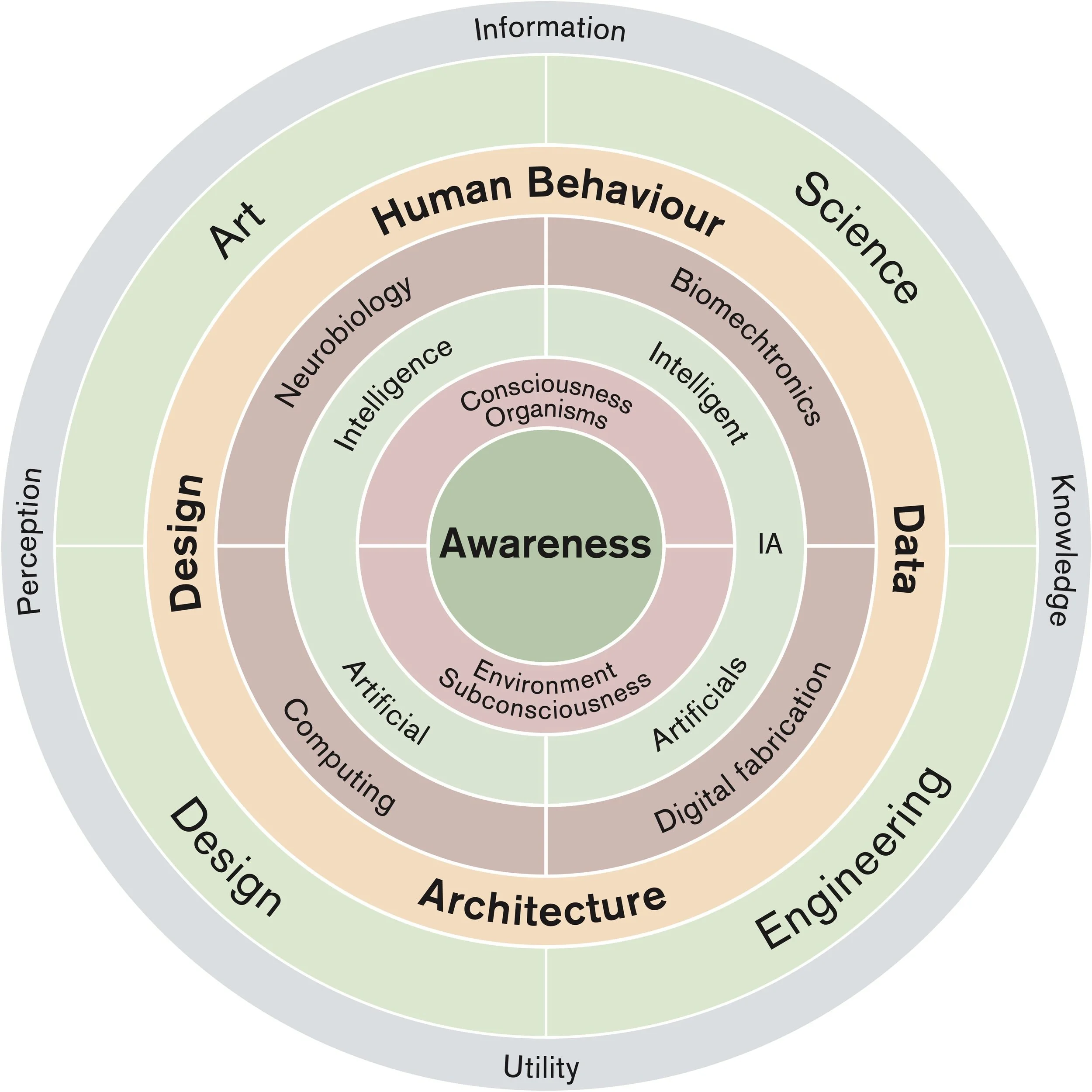
Inspired by the Neri Oxman Mission statement, the wheel of awareness, has been modified to include our thinking between the Art, Science, Design and Data and connection with Human Behaviour design.
An Airport's Sense of Place
By Bianca Weeko Martin
The airport is a city within a city; they are the places where passengers first come in contact with their destinations, an "age-old legacy reminiscent of the 'entrance gate' of walled cities." The airport for me personally has been a subject of fascination ever since my family immigrated from Indonesia, and my childhood became fragmented into frequent visits to airports in Canada and across Southeast Asia.
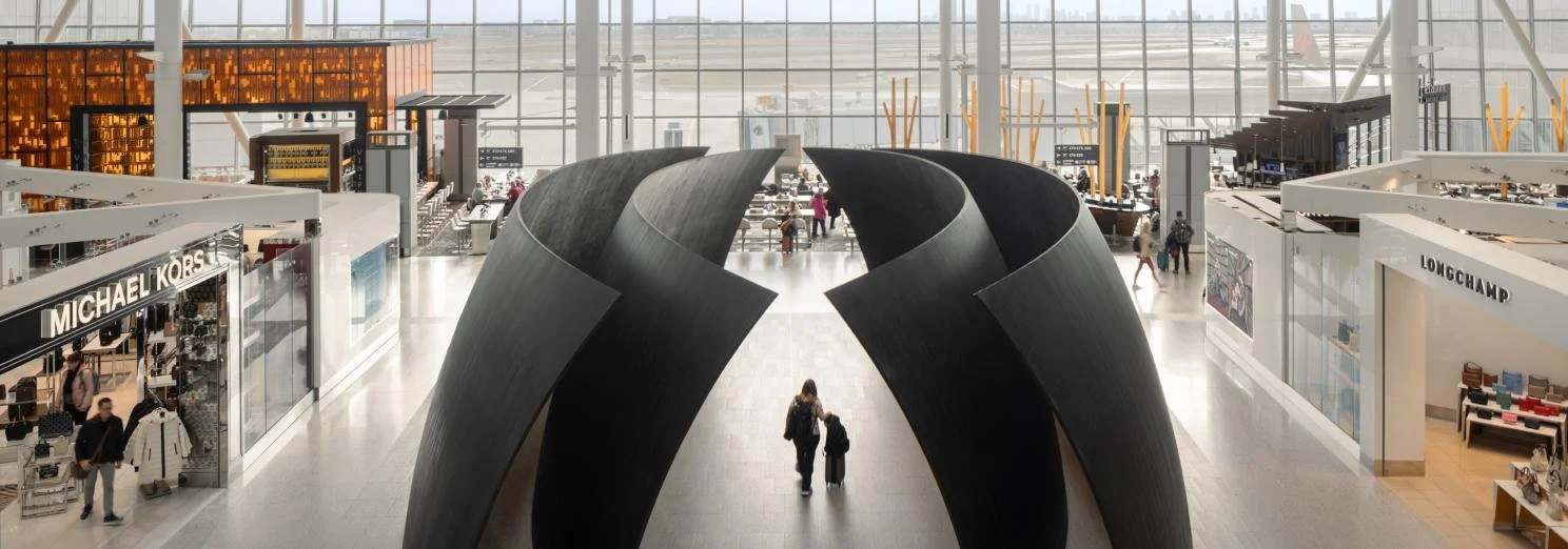
One of the things we were tasked with for an airport revitalization project was to equip the main architects, working out of New York City, with a deep and granular understanding of Toronto's unique "sense of place." A set of clearly defined concepts would inform anyone's understanding of a major transit hub and its needs and requirements. And, in the not-so-distant future, it could provide the guidelines for a future arts program. With such a task in mind, my day-to-day experience of life in Toronto was brought into a certain focus, shining light on public artworks and exhibitions that spoke to something that I could call uniquely Toronto.
Seeing the balloon-like art installations at Waterworks Food Hall made me think of the possibility in a blank canvas, offered to local artists and distributed across an airport's new gate lounges. What shape could they take?
Finding myself in a room of multichromatic mirrors at the Aga Khan Museum inspired me to consider the power and versatility of a simple reflection.
And at the AGO, where the late Filipina artist Pacita Abad was having her big moment, I saw a series of large textile works that expressed diversity in unconventional ways—each panel presenting a fictional character that assembled multiple mythologies, representing a single continent. These had been formerly installed at a train station in Washington, DC.
We shared these thoughts, among other ideas, at a brainstorming session at the DEXD offices on November 8, 2024, where we invited local artists such as Zahra Saleki and artist duo Blue Republic to lunch. We exchanged beautiful sentiments ranging from the abundance of water, an appetite for the future, and the wide-ranging experience of immigrating to and settling in Canada. One of the most poignant takeaways for me was a full reframing of the concept of "diversity," which we so readily associate with Toronto. Yes, Toronto's multiculturalism is profoundly special, but what does it really mean? How would an art piece about diversity function in a place that is as intrinsically diverse as an airport?
Instead of showing a representational portrait of diversity, an artistic intervention within the space of an airport might strive towards mirroring the diversity of passengers back towards themselves: a moment of self-awareness. After all, these are passengers coming from hundreds of different cities of origin, arriving at yet-unknown destinations—considered together, they are in constant motion on any given day. A million individuals with unfinished stories pausing momentarily in the transitory space of the airport.
What will be the last thing they remember before the moment of takeoff?
Typographic Matchmaking
Bridging Arabic and Latin Scripts in the Gulf Cooperation Council (GCC) Region
By Majid Abbasi,
Edited by Suzan Mecitoglu
Typography is more than just letters on a page; it is a tool for communication, navigation, and inclusivity. In the Gulf Cooperation Council (GCC) Region, where Arabic and Latin scripts coexist, designing effective bilingual wayfinding systems is both aesthetic and functional. Each script presents unique challenges, from differing alphabets to the opposite writing directions of Arabic (Right-to-Left) and Latin (Left-to-Right). Addressing these complexities is crucial to fostering inclusivity and accessibility.
Thoughtful integration of Latin script with Arabic creates a harmonious visual system that bridges communication gaps and ensures effective bilingual communication for residents and visitors alike.
Wayfinding systems in the GCC Region must cater to both Arabic and Latin readers, and the contrasting directional flows of the two scripts require careful design considerations. Type size, alignment, and spacing need to be adjusted to ensure readability without compromising the aesthetics of either script. When these elements are not thoughtfully addressed, mismatched or poorly designed typefaces can disrupt the flow of navigation, create visual dissonance, and hinder accessibility in public spaces like airports, shopping centers, and transportation hubs.
This is why typographic matchmaking—harmonizing Arabic and Latin scripts—is critical. Typography is not just about aesthetics; it is about creating connections, improving accessibility, and enhancing user experience. By prioritizing consistency and clarity, designers can deliver wayfinding systems that meet the needs of a diverse audience.
At DEXD, we understand these challenges. Our team of experts in Arabic and Latin typography will lead the way in designing bilingual wayfinding systems tailored to the unique needs of the GCC Region. To further advance this field, we are proud to announce the creation of a professional panel dedicated to typographic matchmaking. Through this initiative, we aim to share insights, set standards, and foster collaboration among designers and typographers across the region.
By addressing the challenges of combining Arabic and Latin scripts, we can ensure that wayfinding systems in the GCC Region are not only functional but also inclusive and beautiful. Together, we can design for a future that connects people and cultures through thoughtful, innovative typography.
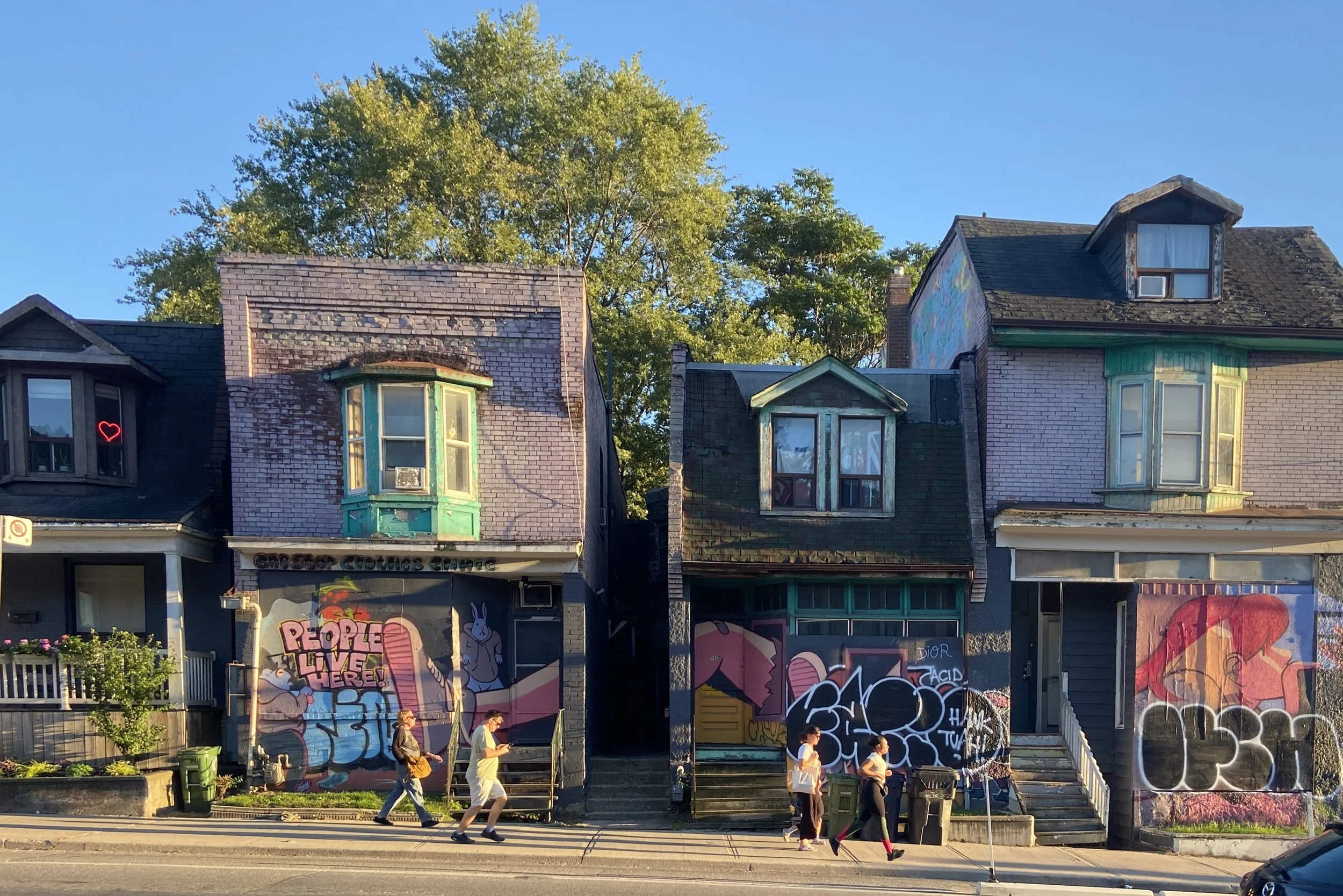
People Live Here
By Daniel Puppin
If the common Torontonian knew just how much cultural loss our architectural cityscape has faced over the last 75 years, I’m sure they’d dwell on it for at least a few moments before carrying on with their day. I tend to dwell on it often – what was, what could have been, and most importantly, what we are becoming.
When asked, "What does this city need?" a typically agreed-upon response is more development - more housing, more infrastructure, more retail. While such a response is not entirely wrong, we won't actually improve this city unless these ambitions are executed thoughtfully and humanistically. The mid-century urban renewal era reminds us that growth without regard for community often leads to loss. Still, we see echoes of those same practices today, where in the name of 'density' we replace entire blocks of unique, individual units with obstructive, exclusive, and obtrusive towers. This undermines the character of the community, the pedestrian experience, and our meaningful interactions with the built environment.
Humanity has built effectively dense, livable, adaptable, beautiful cities for a good millennium prior to this modern trend, and Toronto was once one of them. Density is important, but it is often implemented ineffectively or used as a disingenuous excuse in our current context. Density doesn’t just mean building taller structures where shorter ones once stood; it also means building into the space between spaces or onto the space above spaces, thus forming new spatial dynamics through adaptive reuse and creative solutions. Flat, characterless, repetitive, multi-story boxes often outright replace iconic and significant locations, such as Honest Ed’s and the surrounding Mirvish Village. They erase rows of Victorian shopfronts, where people once lived, explored, and conducted commerce. Or they buy out the beloved standalone burger joint that served as an affordable community staple for decades. Toronto desperately needs culture, not just condos. Our culture deteriorates with every swing of the wrecking ball, with every strongarm against the common citizen, with every stacking of another uninteresting pre-cast slab or synthetic brick panel.
People find joy in the ability to explore the nooks and crannies, to traverse the streets and laneways organically, to be enamoured by a beautiful façade, an extravagant display of lights, or a small business within an established and vibrant community. We have stifled, and continue to stifle, these moments of fluidity and wanderlust.
To be clear, I am not insinuating that we shouldn’t build towers, rather that we should diligently prioritize the wheres, whys, and hows when we do it.
Architecture is the human habitat, it holds powerful influence over our psyche, our mood, our outlook. As designers, it is our responsibility to scrutinize shortsighted city-building practices, keeping these critiques in the back of our minds to avoid repeating the same mistakes of the past. It is of the utmost importance that our city planning allows room for whimsy and charm, that it respects the history, culture, and style of the spaces it seeks to modify, as well as the humanity of the commoner who dwells within. After all, people live here.
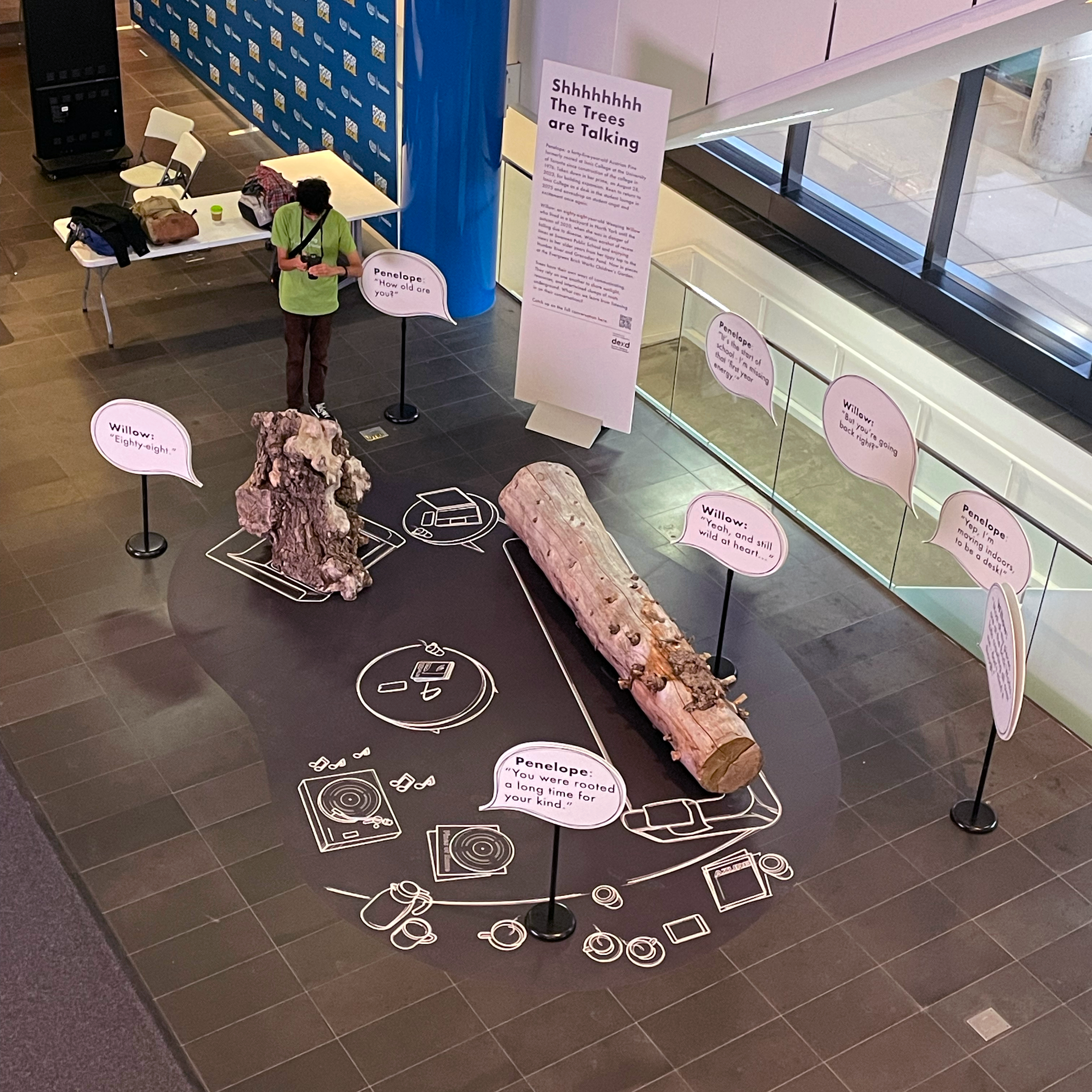
Shhhhhhh The Trees are Talking
Project: AZURE Human/Nature Conference
Climate Change Mitigation in Architecture and Design
Client: AZURE Publishing
Customer Experience Design Team: Gelare Danaie, Karen Zwart Hielema, Bianca Weeko Martin, Majid Abbasi, Ramin Beyraghdar
Project Completion: October 2024
Penelope: a forty-five-year-old Austrian Pine formerly rooted at Innis College at the University of Toronto since construction of the college in 1976. Taken down in her prime, August 28, 2023, for building expansion. Keen to return to Innes College as a desk in the student lounge in 2025 and eavesdrop on student angst and contentment once again.
Willow: an eighty-eight-year-old Weeping Willow who lived until diseased and in danger of falling in a backyard in North York until the Autumn of 2020. Within earshot of recess times at Swansea Public School and views in her older years from her tippy top to the Humber River and Grenadier Pond. Now in pieces at the Evergreen Brickworks Children’s Garden.
Trees have their own ways of communicating. They rely on one another to share sunlight, resources, and intertwined clumps of roots underground. What can we learn from listening in on their conversations?
Penelope lounges on the sofa in the conference room, opens her eyes and discovers another tree. “Hey there!”
Willow looks at her with curiosity. “Hello! I think I know you from across the wood lot, right? … out in Scarborough.”
Penelope didn’t recognize her; she was used to seeing that gnarly side of hers. “Hmm… you’re Willow?”
Willow nods, readjusting her position. “Trees invited to a human/nature conference. Who would have thought it possible! Thank goodness for complementary tickets. I heard they were expensive.”
Penelope stretches her back. “What’s it called again?” “Human – Nature?” “I think they’ll be talking about how we can work together.”
Willow sighs, “I don’t trust these humans, they just talk!”
Penelope sips her coffee. “Well, I took a look at the speaker line up and they’ll be talking about some pretty cool projects.”
“Yeah, but even so - all they talk about is themselves, human-centered design! What about us?”
“Oh, come on Willow, not all of them. They’re learning. Slowly.” She eyes the book in front of Willow, Margaret Atwood’s ‘Old Babes in the Wood: Stories’. She recalls how other trees talked about Willow’s wisdom.
Willow sets down her cup. “You still have that young optimism. How old are you?”
Penelope is a little giddy. “Well yeah, I’m young. I was rooted for 44 years. And have been hanging out on the wood lot for another year. In pieces, waiting ...”
“Ouch! That's not long to be growing – what happened?” Willow thinks how Austrian pines can grow to 500 years, only 44.
Penelope tells her that humans needed to expand the building, and she was in the way. Suddenly she gets excited, “But I’m going back - imagine! I’m moving indoors, to be a desk!”
“Interesting... most of my pieces are at the brickworks, kids crawling all over me - don’t mind it though.”
“You are such a grandma! How old are you?”
“Eighty-eight.”
“Wow, you were rooted a long time for your kind,” exclaimed Penelope. “Weeping Willows usually top out their growth years around 70.”
“Yeah, longer than expected, and I’m still around, still wild at heart.” She winks.
Penelope laughs, “So we live on – what did they call it? … circular economy?”
Willow grudgingly admits. “They really need us, don’t they?”
Penelope listens to music, Joni Mitchell’s ‘Both Sides Now’, sees people in the conference as she speaks softly, “I can remember the animated conversations under my canopy…. couples embracing, students chilling as I worked my magic.”
“Oh, I can relate.” sighed Willow “The family that grew up under my branches had the most relaxed outdoor meals in my shade,” she remembers the urge to hug them – good memories.
“Ok, so you’re not so skeptical anymore,” said Penelope finishing her coffee.
“Mmmm... we trees and humans are deeply connected - we just need to listen to each other.”
Why do I love airport design?
By Gelare Danaie
I’ve been in the business of designing airports, train stations, and subways for a long time now. I guess the reason I chose this career path is that from a young age, I’ve been passionate about flying, traveling, and transportation—or better yet, transformation. Guess what? I used to paraglide in my twenties! But when I think more deeply, I can find other reasons for my passion for airports.
#1 Emotional design
I believe airports are emotional places. From the moment we start our journey, we are both excited and stressed. We think about what can go wrong and dream of arriving at our destination; joy and panic are intertwined. Remember, we are still the same species that weren’t meant to fly. Flying is transformational.
#2 Time as an ingredient of design
Nowhere more than in an airport do we need to work with time—time as an ingredient in our design. What services, amenities, places, and experiences can we offer to bring joy back to air travel? How can we account for the ever-changing nature of airports and design something extraordinary yet flexible? In the aviation world, nothing stays the same, even in a year, let alone over the timeline of a project. The challenge is to consider time as one of the key ingredients of design.
#3 Gateway
Airports are the gateway to a place, forever associated in people’s memories as the first impression of a location. We need to find and design that character. Our team at DEXD is part of the consulting group for Pearson International Airport’s Terminal 1 and Terminal 3 Revitalization Program. Our design mandate is to create a space that is “Local and Inspiring,” reflecting the character of the region we call home. We ask ourselves: what is the essence of Toronto and the Golden Horseshoe as a place?
Now, let’s put all three ingredients together: emotions, time, and character. You’ll agree with me that designing an airport is similar to writing a novel—complex and fun!
Read more about Pearson Airport Lift Program
Windows and The Seen
By Kha Den De / Lera
Edited by Cody Foo
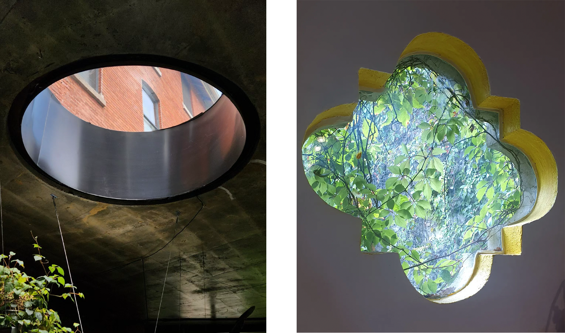
Windows are integral part of everyday life, an essential component in every living space. But have you ever thought about their role beyond their basic functions?
As per definition, a window's function is to let light and air in and to allow one to see through. They come in various forms, however, people hardly ever pay attention to the windows themselves and only look through them.
Windows act as a façade, separating interior and exterior surroundings. At the same time, they are framing one's view, directly influencing what is seen and how it is seen. Depending on one's position in relation to the window, the gaze angle changes and so too the view from the window. One's perception of reality can be shaped by windows, as they have the power to allow or restrict one's sight - choose what to display or what to conceal.
We can think about public spaces in a similar manner. People are constantly existing in shared spaces but rarely pay close attention to the surroundings. As designers and planners, we shape public spaces and form peoples outlook on them. Even if our placemaking efforts might not seem visible at a glance, people's positive experience is the greatest proof of our 'invisible' intervention.
For example, some of the upcoming Ontario Line South subway stations are reinstating heritage façades which comes with updating the original facade's design features, including the windows. While some of those windows will continue to serve their function, others will be covered to fuse with the walls. The choice behind keeping a window open or concealing it translates into design choice of shaping what is seen and unseen to a space user.
"Mission: Possible"
By Gelare Danaie
After 20+ years in architectural practice, traveling, experiencing life, and observing the connections between people and places, I realized what truly important to me is to be able to impact everyday life by designing spaces for people, and to challenge the top down approach of architectural practice.
Although the experiential design layer is the first impression for people, harmonizing and managing its elements is usually a tricky task for architects. Having the experience of being an architect in charge of managing the consultants in a large scale project, I realized there is a gap in the practice of overseeing all the public facing elements that include wayfinding, environmental graphic design, digital communication, advertising, activation, and art.
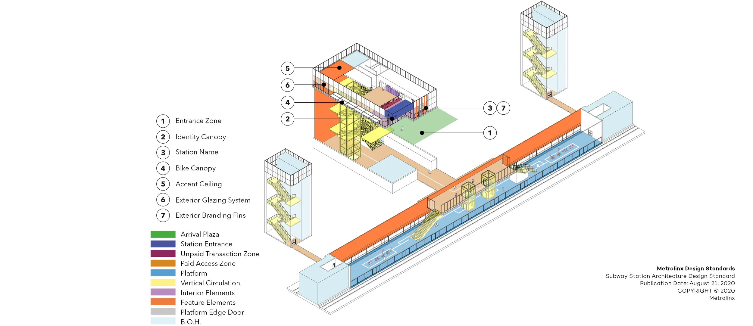
This is how DEXD came to life. I decided to create a platform that would combine architectural planning and experiential elements in complex environments. Our first major contract was Metrolinx Subway Station Architecture Design Standard. The mandate was to prepare a design standard for all the subway stations within GTHA area, the most important project being Ontario Line South!
While working with Metrolinx back in 2020 and as we were mapping all the architectural typologies of stations for the future line, I opened my personal notebook and wrote down my vision with a sharpie pen: «DEXD will be the Wayfinding designer for the line!»
Fast forward to 2023, my phone rang on a Friday afternoon in August and I got the news that we were chosen as the Wayfinding consultant for all Ontario Line South stations.
I believe business and life are similar, there are lots of ups and downs, wins and losses, but if you have a vision, you share your true values, and put all your heart in what you do, there is a big chance you will achieve what you want.
Metrolinx Subway Station Architecture Design Standards
A Comprehensive Standard for the Future of Transit
A Comprehensive Standard for the Future of Transit
Client: Metrolinx
Design Team: Gelare Danaie, Greg Parsons, Karen Zwart Hielema, Pedro Andrade, David Schellinger, Alireza Atarian, Stephen Read, Matt Ziyaee
Urban Realm Consultants: Stantec; gh3
Consultant Team:
Mechanical, Electrical, Communications: Quasar Engineering
Code: Senez Company
Acoustics: Thornton Tomasetti
Industrial Design: Yellow Window
Specifications: DGS Consulting
Project Completion: November 2020
Within a of strong field of both local and international design competition, DEXD was the successful proponent and awarded the new Metrolinx Subway Design Standard RFP.
At the beginning of the Covid 19 Pandemic, and under an aggressive and demanding schedule, the DEXD team was confident in delivering a robust, measurable, and enforceable Standard, while focusing on enhancing the customer experience and contributing towards transforming the transportation experience across the Greater Toronto Area (GTA).
As the current transportation network within the GTA expands at a rapid pace, it remains critical to ensure the customer is able to get to their destination quickly, efficiently and safely.
With the many modes of transportation and their various interfaces, user consistency was a key component when evaluating the standards document.
Our approach to the project began by first immersing our team towards understanding the many transit user profiles, understanding their expectations, theirs challenges, while focusing on a human centric design methodology.
Weekly scheduled meetings with our client allowed us to connect regularly, where we were able to listen, learn, share, trust, and truly collaborate albeit in a virtual environment.
With the vast array of stakeholders and their wealth of knowledge and transportation experience, we were able to successfully navigate, discuss, and implement an exhaustive list based on stakeholder feedback.
After a rapid 11 week turnaround of developing and sharing a variety of visual content at scheduled milestones, the DEXD team was successful in delivering a comprehensive and vigorous standard, that will be significant towards contributing towards meaningful design and positively impacting the human experience.
Attempts to Establish Myself in A Local Community
By Kha Den De / Lera
Have you ever thought about getting involved in your local community? - I certainly have.
After adapting to a new city and establishing a good friend group, I made it my next goal to become a part of a neighbourhood community. I've always wanted to be a regular at a shop, or be friends with a neighbour - I wanted to experience that feeling of belonging.
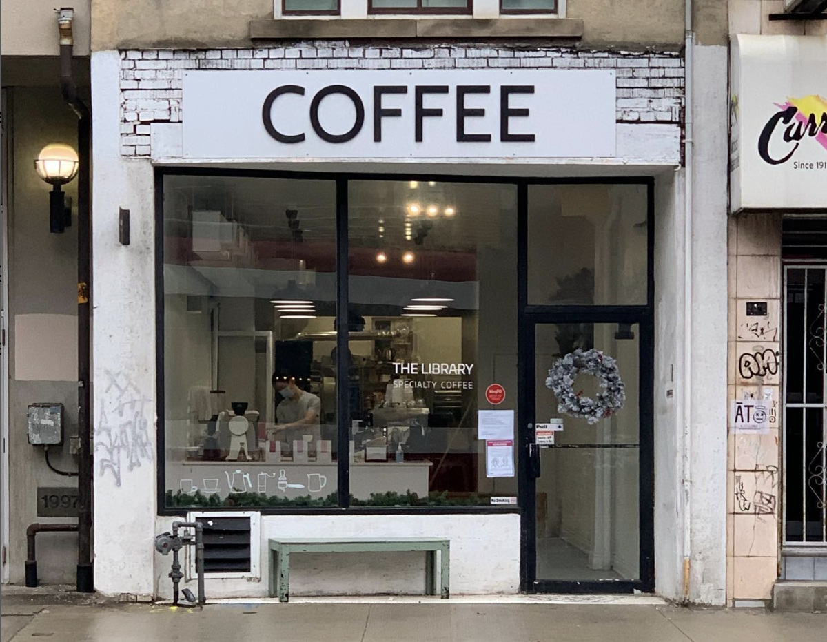
My first attempts took place when I moved to a new area. I started by exploring the surroundings to find places I gravitate to. Eventually, I discovered a couple of local businesses, including THE coffee shop. While I am happy to report that I started having friendly conversations with owners and employees of several local spots, the closest relationship I've established is with a barista in now my favourite cafe.
An occurrence that prompted me to write this post happened last week. Coffee in that place is always excellent, however, THE barista is particularly good at making matcha. For a bit over a year, I've been telling all of my friends that THE barista is making the best matcha latte in the city. So I came there with my friend, we ordered matcha and were chatting with THE barista. Meanwhile, another employee was going to start preparing our drinks, but THE barista stopped them saying: "I'll do it, she is my customer."
Being called 'my customer' felt really heartwarming. I suddenly realized that I was not the only one who considered this friendly relationship special. As discussed in my previous post 'People and Places', the community is what makes you feel at home, since being part of the community brings social fulfillment and simple everyday joy.
Like this coffee shop, any place can create a canvas for joy. So when designing a district or a public space, we should never forget about its occupants and what would make that space special for them.
Union Station Bus Terminal Public Art Project
‘On the Road’ is a series of 15 aluminum figures that speak to the universal experience of travel.
‘On the Road’ adds playful narrative to the Union Station Bus Terminal
Client: Metrolinx
Design Team: Karen Zwart Hielema, Gelare Danaie, Pedro Andrade
Artist: Anna Passakas and Radoslaw Kudlinski of Blue Republic
CIBC Square Architects: Wilkinson Eyre Architects, Adamson Associates Architects
Project Completion: November 2021
‘On the Road’ is a series of 15 aluminum figures that speak to the universal experience of travel. These figures are bold, colourful, and organic in form, in contrast with the neutral colour palate and rectilinear nature of the Union Station Bus terminal at 81 Bay Street in Toronto.
Take the time to explore these figures while waiting to catch your bus and you will find yourself reflecting on your own travel experiences and adventures.
As the public art consultant DEXD managed the entire process of artist selection, jury sessions, technical reviews, and the installation of the final work.
The installation of the artwork took place over the course of three days in November 2021. The figures were affixed directly to the glass panelled wall by a team of six.
Metrolink Blog: New Artwork Aims to Further Transform Union Station
Metrolink Blog: New Video Shows Artwork Going Up at Union Station
Eglinton Crosstown and Finch West LRT lines Customer Journey Mapping
Client: Metrolinx
Design Team: Gelare Danaie, Karen Zwart Hielema, David Schellinger, Cody Foo, Bianca Weeko Martin
Project Completion: 2024
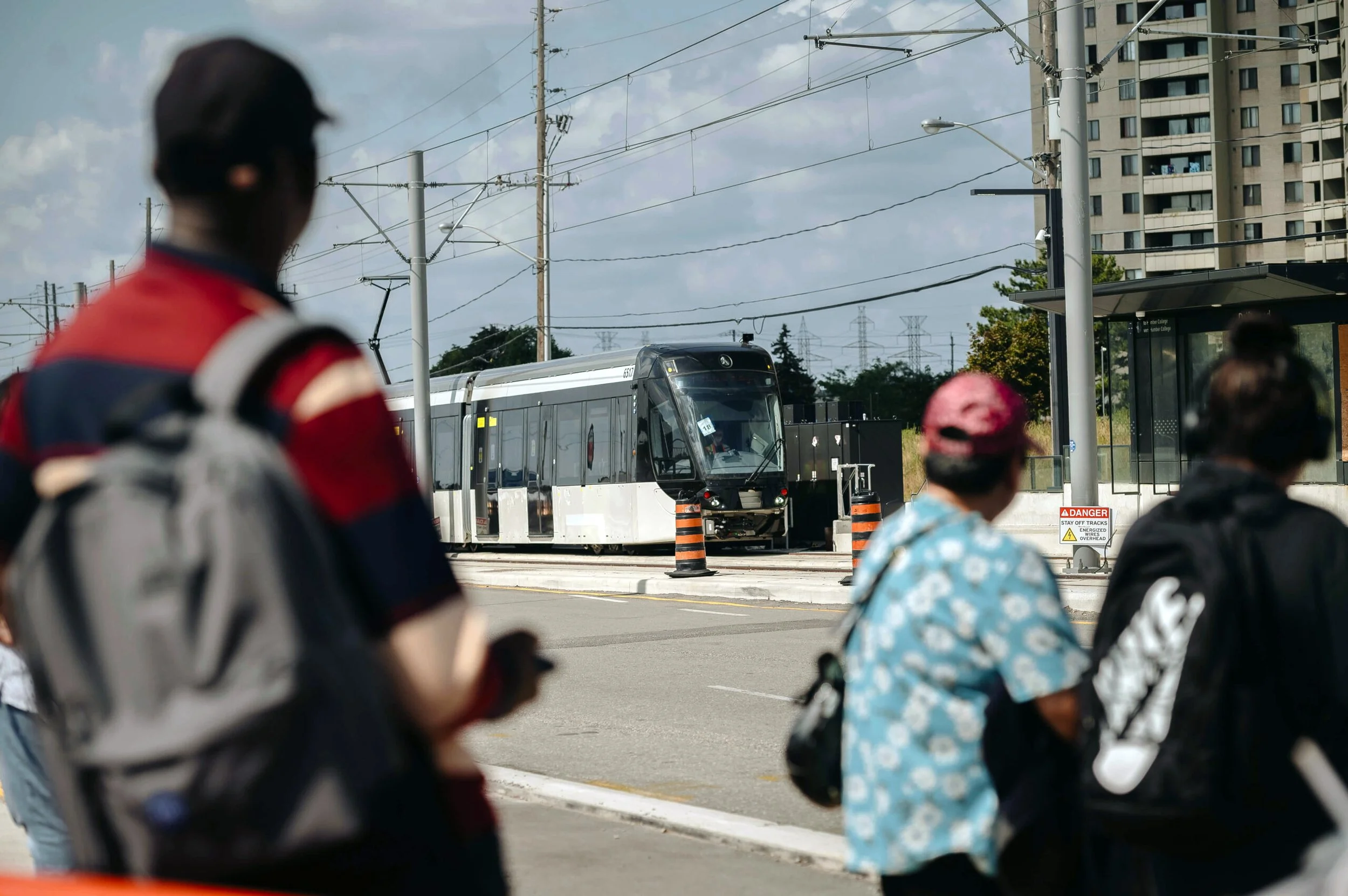
With 43 stops across 30 km, The Eglinton Crosstown and Finch West Light Rail Transit (LRT) lines are transformative projects aimed at enhancing public transportation infrastructure in Toronto, Canada. These two lines signify a substantial investment in modern, efficient, and sustainable transit options for residents and visitors.
DEXD was tasked to map out the customer journey of these LRT lines, to ensure they are designed not just as transportation solutions but as holistic experiences that prioritize passenger needs and satisfaction.
Combining station site visits, in-studio research, and community feedback, the DEXD team created five personas to represent future customers for the LRT lines. Mapping out journeys for each persona identified touchpoints such as pain points and moments of delight. These were then analyzed to inform strategic opportunities like the ideal placement of signage to facilitate easy movement through the stations and connections with other modes of transportation.
The findings were then presented to the respective LRT teams at Metrolinx to provide comprehensive insights, including additional information pinpointing deficiencies that could be rectified prior to as well as after the system's public opening. This proactive approach ensured that Metrolinx was equipped with essential data to address any potential issues and enhance the overall performance and reliability of the LRT system before and after its official launch.
By integrating customer journey mapping into the planning and implementation of the Eglinton Crosstown and Finch West LRT lines, Toronto is not only investing in modern and efficient transit solutions but also prioritizing passenger satisfaction and well-being. These projects represent a paradigm shift in urban mobility, where the passenger experience is at the forefront of decision-making, ultimately leading to a more connected, accessible, and inclusive city for all.
A Eulogy to the Scarborough RT
By Bianca Weeko Martin
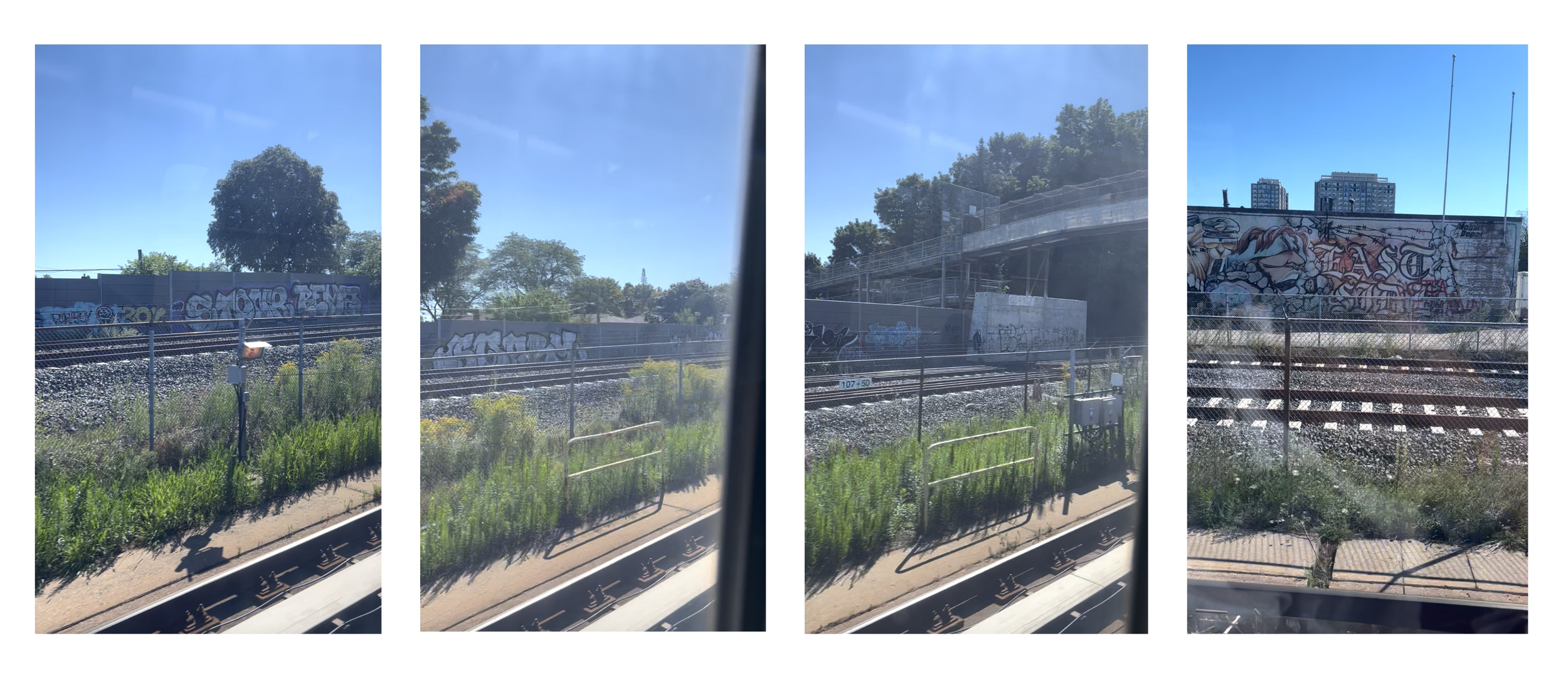
The Line 3 Scarborough RT train derailed on July 24, 2023, terminating service prematurely. Growing up in Scarborough, I saw the RT as something like a geographic meter stick for situating myself and my home, as my family moved from our first apartment near the intermodal Kennedy Station to the farther east fringes of Malvern—past the end of the line. The news of the closure surprised and saddened me. As a tween, I enjoyed watching all the graffiti tags and pieces on the walls flashing by on the tracks, and I felt a sense of unspoken comfort on the vehicles seeing the sleepy faces of immigrant students, workers, and commuters, which more closely here than anywhere else in Toronto mirrored my own.
When I began middle school, I had to commute home by myself, which gave me the pluck of a 12 year-old taking on the long commute from Yonge and Sheppard to Scarborough on her own everyday. I have unfortunate memories of waiting at bus terminals without earphones and transferring buses in the cold, but I never felt danger. I do not take for granted that a single bus fare could cover 20 kilometers of travel and provide me access from the inner suburbs to the city, and that this city would eventually become the crucial subject and setting of my adult days.
In architecture school, I took most of my internships abroad, and was thus able to develop a more holistic understanding of public transit with new reference points in distant places: Prague, Melbourne, New York, Mexico City, Berlin, Manila. I found the public transit system of Manila in particular more challenging than any I had encountered before, and so I felt a proportionally heightened sense of empowerment when I successfully decoded its mysteries: for example, one had to combine the metro with informal transit options like jeepneys (military vehicles repurposed into public buses) and tricycles (motorcycles fitted with extra seats) or even motorcycle taxi apps (i.e. Grab) in order to fill wide gaps in the daily commute. Indeed, I made use of active transportation. My aunt called me brave. But I recall a quote by Gustavo Petro, Mayor of Bogotá: “A developed country is not a place where the poor have cars. It's where the rich use public transportation.”
Nowadays, I find myself serendipitously working on a variety of public transit projects: customer journey mapping for new LRT lines in Toronto with DEXD; a public art plan for a transit system in Saskatoon. I have many hopes and dreams for these new and impressively designed transit lines, and I have heard the hopes and dreams of others through research and outreach sessions we have conducted within our communities. I recently came across a public art piece, ‘Masstransiscope,’ by Bill Brand installed in New York City in 1980, and wondered what something like this could look like in the city I call home. And I can't help but think back to the colourful, screeching rides of the Scarborough RT of my childhood.
The Tenor Building Wayfinding and Signage
Client: BentallGreenOak
Design Team: Gelare Danaie, David Schellinger, Suzan Mecitoglu, Kha Den De/ Lera, Ramin Beyraghdar
Location: Toronto, ON
Project Completion: On-going
Vibrant and Dynamic – The Tenor is embarking on an exciting journey to enhance its signage and wayfinding experience!
Nestled in the bustling heart of Downtown Toronto, The Tenor attracts a substantial flow of visitors every day, necessitating a streamlined wayfinding system. DEXD was tasked to transform the wayfinding in the building to make it accessible and intuitive.
As a starting point, DEXD team has crafted a comprehensive Signage & Wayfinding Report, that investigated existing challenges and presented innovative solutions. The report commenced with a site analysis, during which the DEXD team conducted a site survey, created flow diagrams, and collected information and observations pertaining to navigation within the building. Subsequently, the team benchmarked projects of a similar nature and identified the most prominent wayfinding pain points present at The Tenor. By analyzing these pain points, DEXD identified opportunities for improvement and proposed the kit-of-parts approach for a tailored solution.
Following the initial report, the DEXD team developed and delivered a detailed design package based on the proposed kit-of-parts approach. The new wayfinding system has now been fully implemented at The Tenor, enhancing clarity, accessibility, and the overall visitor experience.
Panopticons in Modern Cities
Written and Edited by Kha Den De / Lera
Do you ever feel like you are being watched?
Such feeling is probably common among those who live in big cities. It is normal to feel gazes in an open public space. However, one site that stunned me by its hidden exposure is Allen Lambert Galleria.
Allen Lambert Galleria is a multi-use public space with high people flow throughout the day.
Large open space, use of glass all over the structure, and the fact that Galleria is bordered by offices with inward looking windows make it easy to do observations from different perspectives.
Office workers can easily watch people walking down through the hallway. At the same time, pedestrians can also see those, whose workplace is next to the windows.
Glass walls allow people inside the building look at people outside, and vice versa.
The openness of common area, that follows the hallway, reveals a panoramic view for surveillance.
As a space for surveillance, Allen Lambert Galleria can be compared to Panopticon - in the atrium, people watch each other from almost everywhere. Unconscious gaze is what one experiences while being there.
While unconscious gaze is a normal occurrence in any public space, what can be done to make a space like this more intimate? It is important for people to have a choice between being exposed and having some privacy. As designers, what can we do to accommodate everyone within large-scale spaces?
Abeja District Phase Four, Signage & Wayfinding
A master planned community like no other
Photo Courtesy of BDP Quadrangle
Abeja District Phase Four, Signage & Wayfinding
A master planned community like no other
Client: Cortel Group
Design Team: David Schellinger, Gelare Danaie, Daniel Puppin, Karen Zwart Hielema, Matt Ziyaee
Prime Architect: BDP Quadrangle
Project Completion: On-going
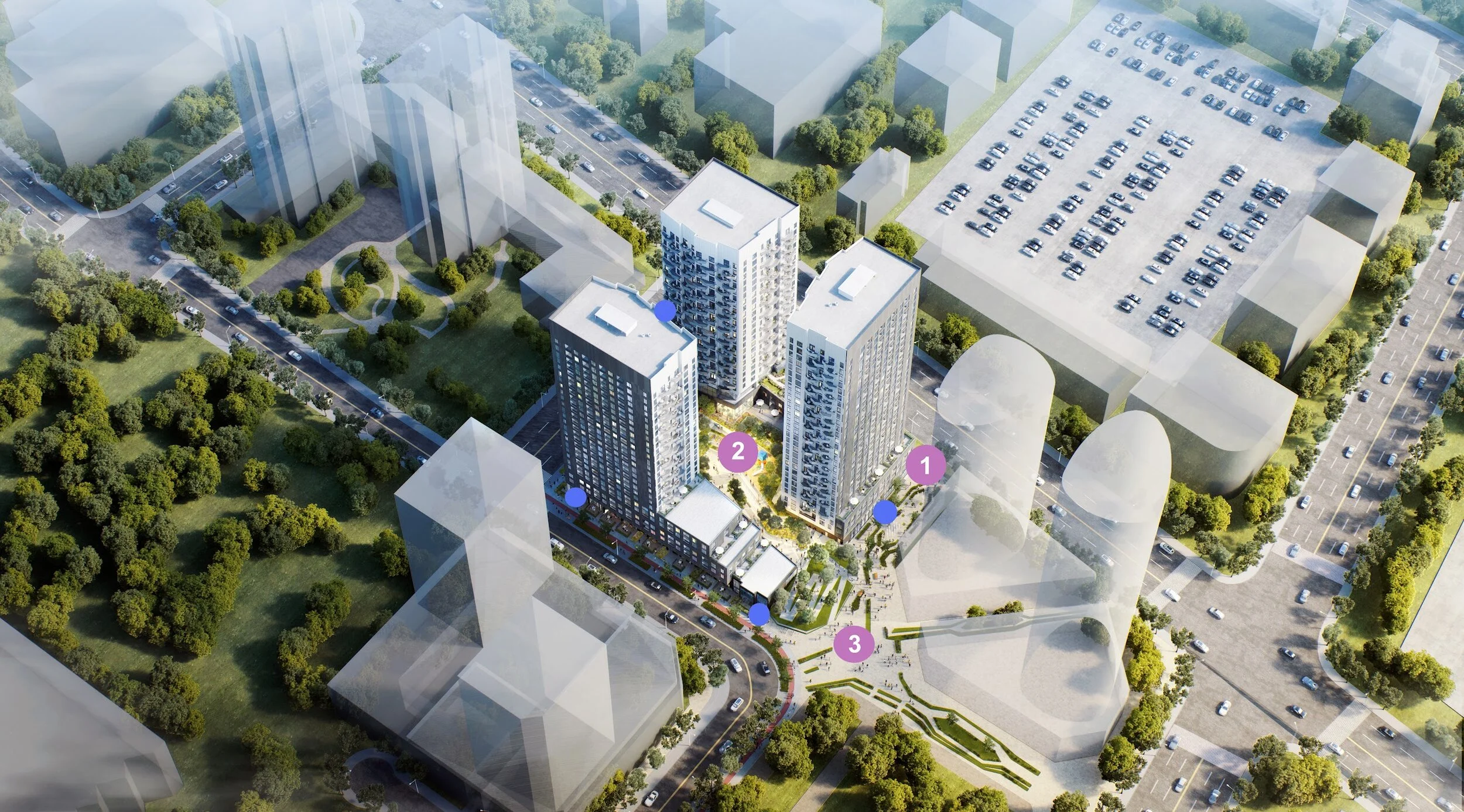
The Abeja District Project’s goal is to create a holistic, sustainable community. Located at Jane Street and Rutherford Road, this master-planned development is envisioned as a vibrant hub of life and activity, blending new condos, mixed-use, and commercial spaces into a dynamic urban fabric.
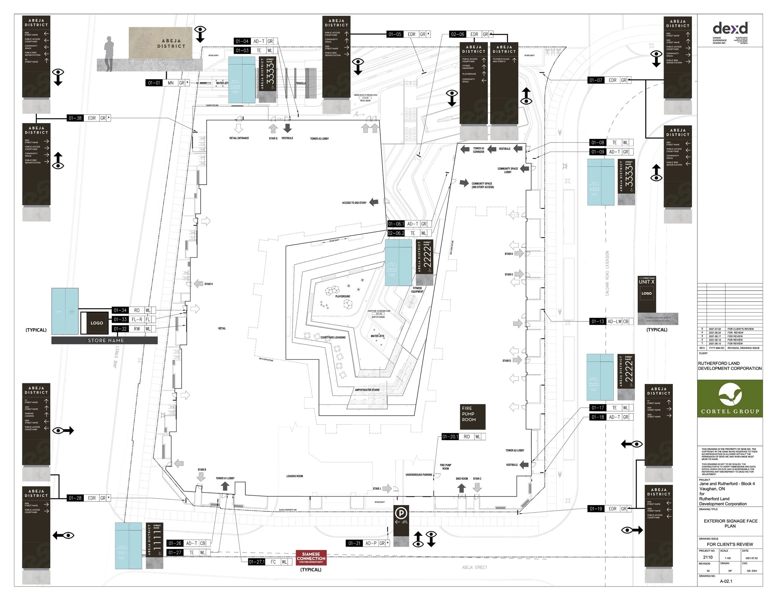
We began our work on the Abeja Wayfinding System for Block Four of the development with three towers, by looking to the larger planning context for the development, encompassing both the parcels under Cortel Group control as well as the surrounding city context.
By documenting the expected master flow patterns for various types of users, we can better understand how people come to the site though public transportation or private vehicles, on foot or on bike. These flow patterns then help us to identify decision nodes, where different users and/or modes may come together, which would most benefit from having strong directional signage, branded experiences as well as public art.
Wayfinding Pyramid
We looked at the different routes that people would take to go between each of the nodes and how the wayfinding can be further enhanced through the views to nodes or the addition of signage elements. Lastly, we looked at the type of character that will be found in the collective spaces, to see where we can further enhance the character through branded environments that incorporate, architecture, landscape, signage, and public art all together. These places are identified as opportunities for what we are calling “placemaking”
1. Certainty (Identity and Code Signage)
2. Navigation (Directional Signage)
3. Delight (Monumental Signage, Branded Environments and Public Art)
Wayfinding and Brand
Abeja district block four is designed with a creative architectural theme which is simple, black with clean lines outside and playful light-colored with a beehive balcony looking inside. After a round of design collaboration meetings with the architects, landscape, and the project team, the decision was to keep the wayfinding graphic design as minimal, simple, and elegant as possible.
Our first design inspiration comes from the overall exterior look for the building, which is rendered in a darker monotone black/blue palate. As such, our signs work with a matte black color for the base of the exterior signs, with white illuminated messaging for increased legibility.
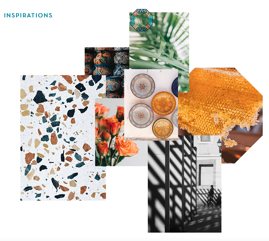
The exterior signs incorporate abstract elements of the Abeja logo in a tone-on-tone contrast to provide a subtle yet rich level of detail without compromising the elegant nature of the signs overall. For feature signs such as our monument sign along the public right of way, we drew inspiration from the Spanish heritage of the development by incorporating large slabs of Spanish Stone (or other similar stones) that are a signature building material of most Spanish architecture.
The interior design character of the building lobbies are rendered in a playful environment with a colorful and textured pallet. As such, our use of the base black signage works well to help stand out from the visual noise and provide clear focus on the directional messaging as much as possible.
Staring Out of Windows
Written and Edited by Suzan Mecitoglu
As the bus follows the familiar route, I can't help but be captivated by the subtle changes that unfold in the neighborhood outside the window. Each day, as I pass by, I notice the little transformations that, piece by piece, shape the character of this city I call home.
A new splash of color on an old building, a vibrant mural adorning a once-dull wall, or a blossoming garden in place of boring concrete – these small changes breathe life into the streets.
Watching these changes through the bus window fills me with a sense of connection to my surroundings. It reminds me that just as this neighborhood grows and evolves, so do I. With every passing day, I cherish the memories of the past while embracing the promises of the future, knowing that change is inevitable and brings new stories to this ever-changing landscape.
With each passing day, I am remined of the power of creativity and the potential for positive change. The possibilities are endless as we work together to build a dynamic city that honors the past while welcoming the promises of the future.
As architects and city dreamers, we can envision endless opportunities to make a meaningful impact on this evolving city.
Princess Hollywood Wayfinding
Princess Hollywood Wayfinding
Client: Cortel Group
Design Team: Gelare Danaie, David Schellinger, Suzan Mecitoglu
Prime Consultant: BDP Quadrangle
Location: Vaughan, ON
Project Completion: On-going
Welcome to the Princess Hollywood, a Signage and Wayfinding system for an exquisite development, designed to embrace community creation.
Located north of Highway 7, west of Creditstone Road, and south of Barnes Court, the complex is adjacent to a major transit hub and highway so that residents and visitors can enjoy convenience and accessibility.
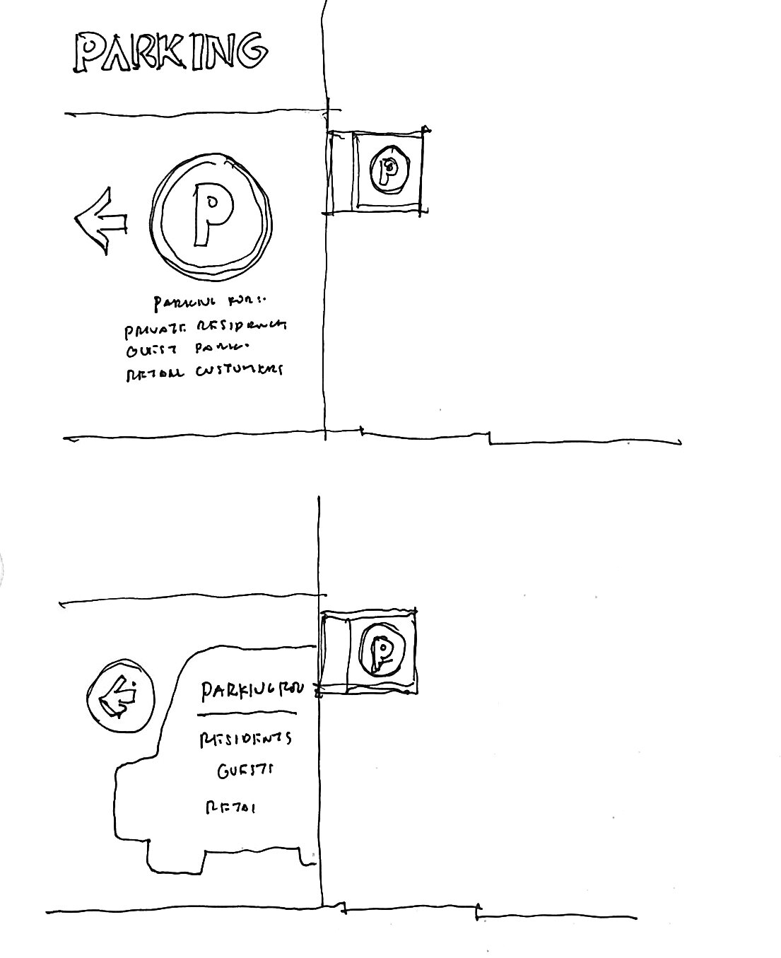
To bring the project vision to life, DEXD team studied how various user types access the site. By understanding their arrival processes, we identified key areas where strategic placement of clear directional signage was required.
Mimicking the architectural design's vision
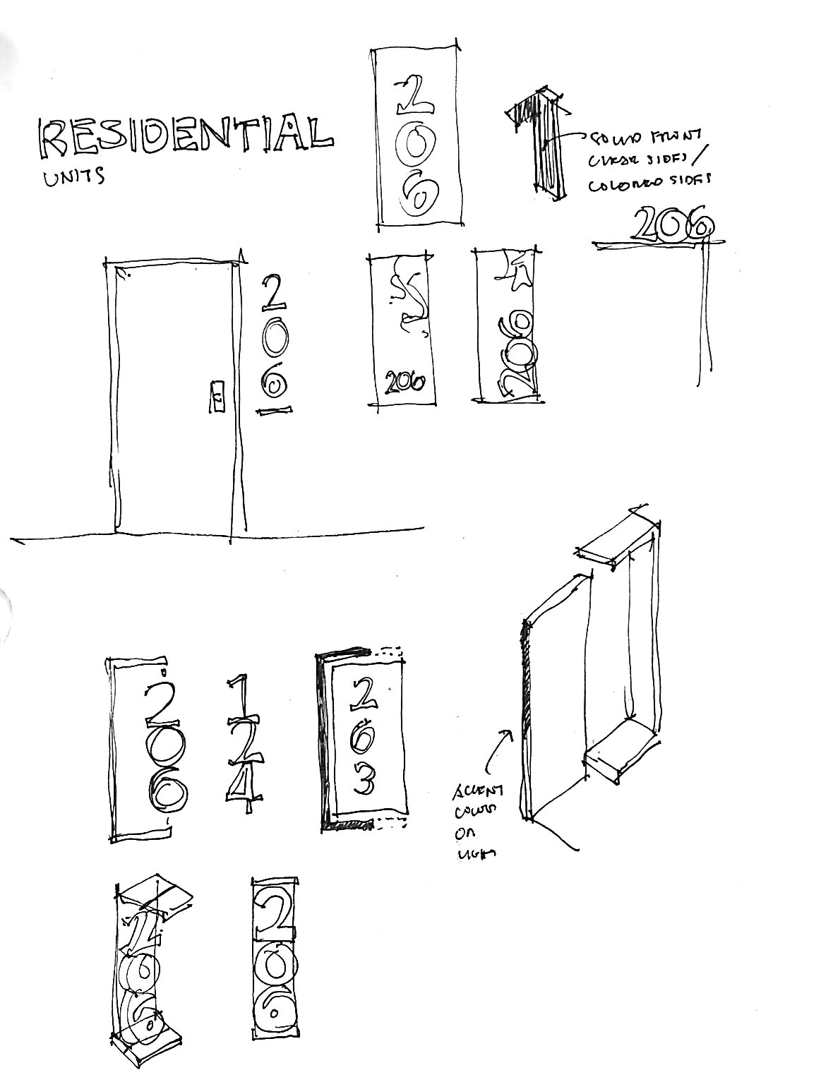
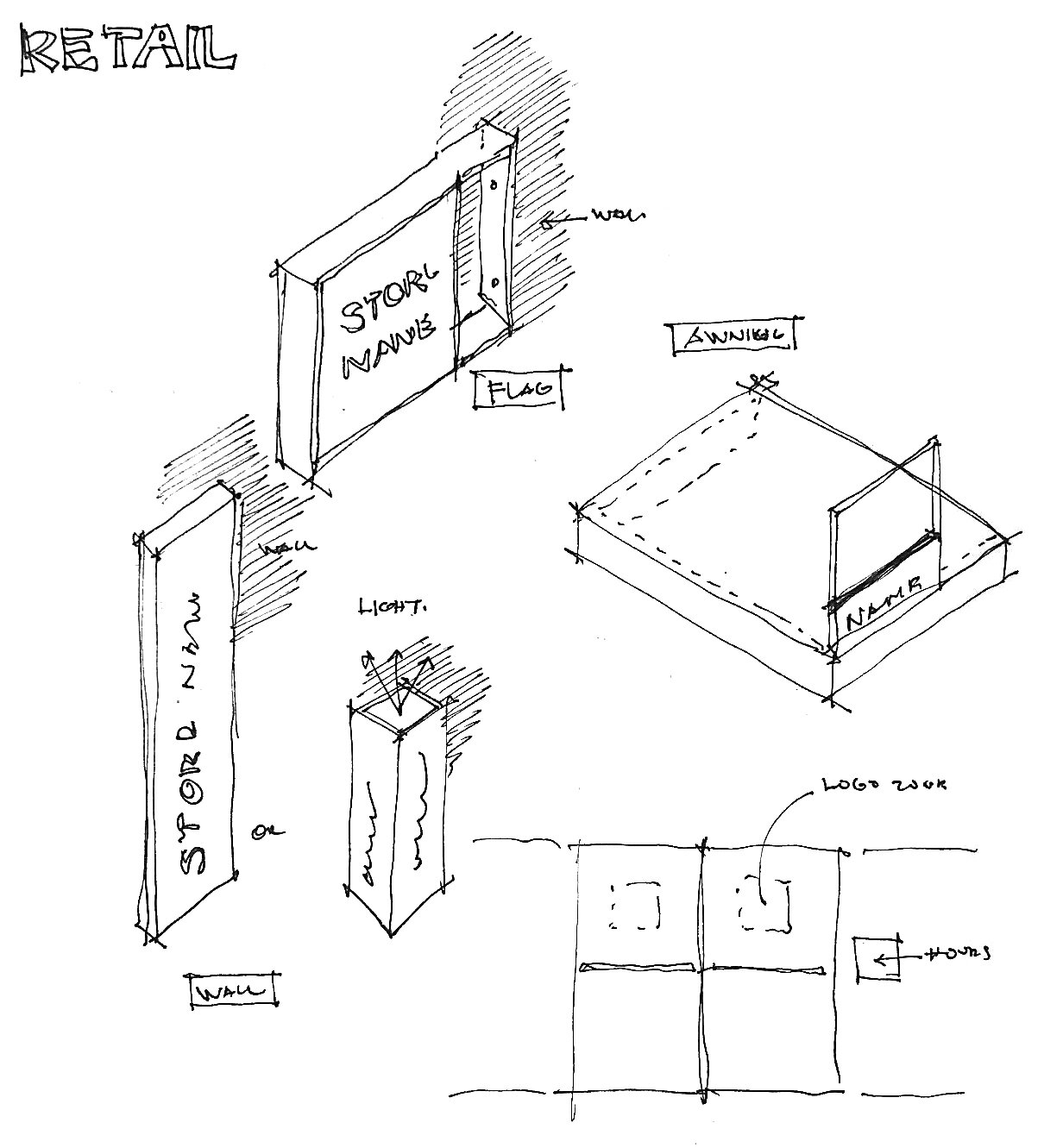
Drawing inspiration from the building's façade, we focused our design on framing the signs and taking cues from the strong grid structure of the building. The frames are strongly expressed and often offset from the sign face, allowing for a very clean and rectilinear look.
Wayfinding and Brand
Finally, we carefully considered physical signage elements like color, materials, typeface, and iconography, taking inspiration from the brand vision and architectural concept. To achieve a clean aesthetic, we opted for subtle colors that complement the raw and soft exterior concrete.
The use of faux wood, inspired by the wood timber beneath the portico, adds warmth and continuity to the design. Typeface and icons were also meticulously selected to show an elegant and sophisticated ambiance, aligning seamlessly with the building's overall identity and brand image.

