DESIGN BLOG
Thoughts
&
Musings

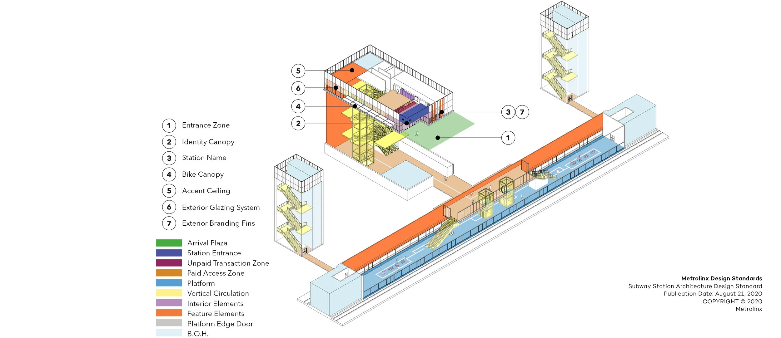
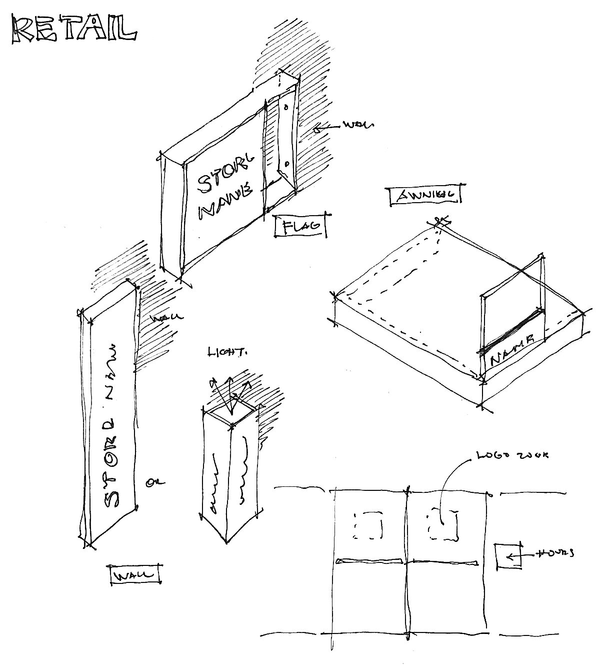
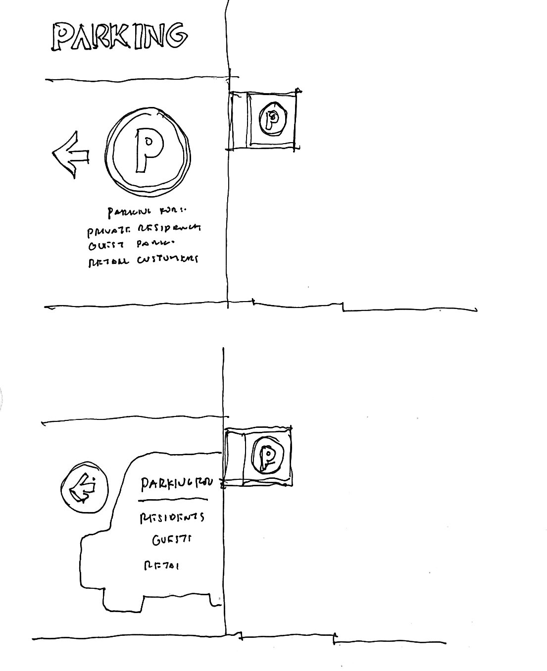
Metrolinx Subway Station Architecture Design Standards
A Comprehensive Standard for the Future of Transit
A Comprehensive Standard for the Future of Transit
Client: Metrolinx
Design Team: Gelare Danaie, Greg Parsons, Karen Zwart Hielema, Pedro Andrade, David Schellinger, Alireza Atarian, Stephen Read, Matt Ziyaee
Urban Realm Consultants: Stantec; gh3
Consultant Team:
Mechanical, Electrical, Communications: Quasar Engineering
Code: Senez Company
Acoustics: Thornton Tomasetti
Industrial Design: Yellow Window
Specifications: DGS Consulting
Project Completion: November 2020
Within a of strong field of both local and international design competition, DEXD was the successful proponent and awarded the new Metrolinx Subway Design Standard RFP.
At the beginning of the Covid 19 Pandemic, and under an aggressive and demanding schedule, the DEXD team was confident in delivering a robust, measurable, and enforceable Standard, while focusing on enhancing the customer experience and contributing towards transforming the transportation experience across the Greater Toronto Area (GTA).
As the current transportation network within the GTA expands at a rapid pace, it remains critical to ensure the customer is able to get to their destination quickly, efficiently and safely.
With the many modes of transportation and their various interfaces, user consistency was a key component when evaluating the standards document.
Our approach to the project began by first immersing our team towards understanding the many transit user profiles, understanding their expectations, theirs challenges, while focusing on a human centric design methodology.
Weekly scheduled meetings with our client allowed us to connect regularly, where we were able to listen, learn, share, trust, and truly collaborate albeit in a virtual environment.
With the vast array of stakeholders and their wealth of knowledge and transportation experience, we were able to successfully navigate, discuss, and implement an exhaustive list based on stakeholder feedback.
After a rapid 11 week turnaround of developing and sharing a variety of visual content at scheduled milestones, the DEXD team was successful in delivering a comprehensive and vigorous standard, that will be significant towards contributing towards meaningful design and positively impacting the human experience.


Union Station Bus Terminal Public Art Project
‘On the Road’ is a series of 15 aluminum figures that speak to the universal experience of travel.
‘On the Road’ adds playful narrative to the Union Station Bus Terminal
Client: Metrolinx
Design Team: Karen Zwart Hielema, Gelare Danaie, Pedro Andrade
Artist: Anna Passakas and Radoslaw Kudlinski of Blue Republic
CIBC Square Architects: Wilkinson Eyre Architects, Adamson Associates Architects
Project Completion: November 2021
‘On the Road’ is a series of 15 aluminum figures that speak to the universal experience of travel. These figures are bold, colourful, and organic in form, in contrast with the neutral colour palate and rectilinear nature of the Union Station Bus terminal at 81 Bay Street in Toronto.
Take the time to explore these figures while waiting to catch your bus and you will find yourself reflecting on your own travel experiences and adventures.
As the public art consultant DEXD managed the entire process of artist selection, jury sessions, technical reviews, and the installation of the final work.

The installation of the artwork took place over the course of three days in November 2021. The figures were affixed directly to the glass panelled wall by a team of six.
Metrolink Blog: New Artwork Aims to Further Transform Union Station
Metrolink Blog: New Video Shows Artwork Going Up at Union Station
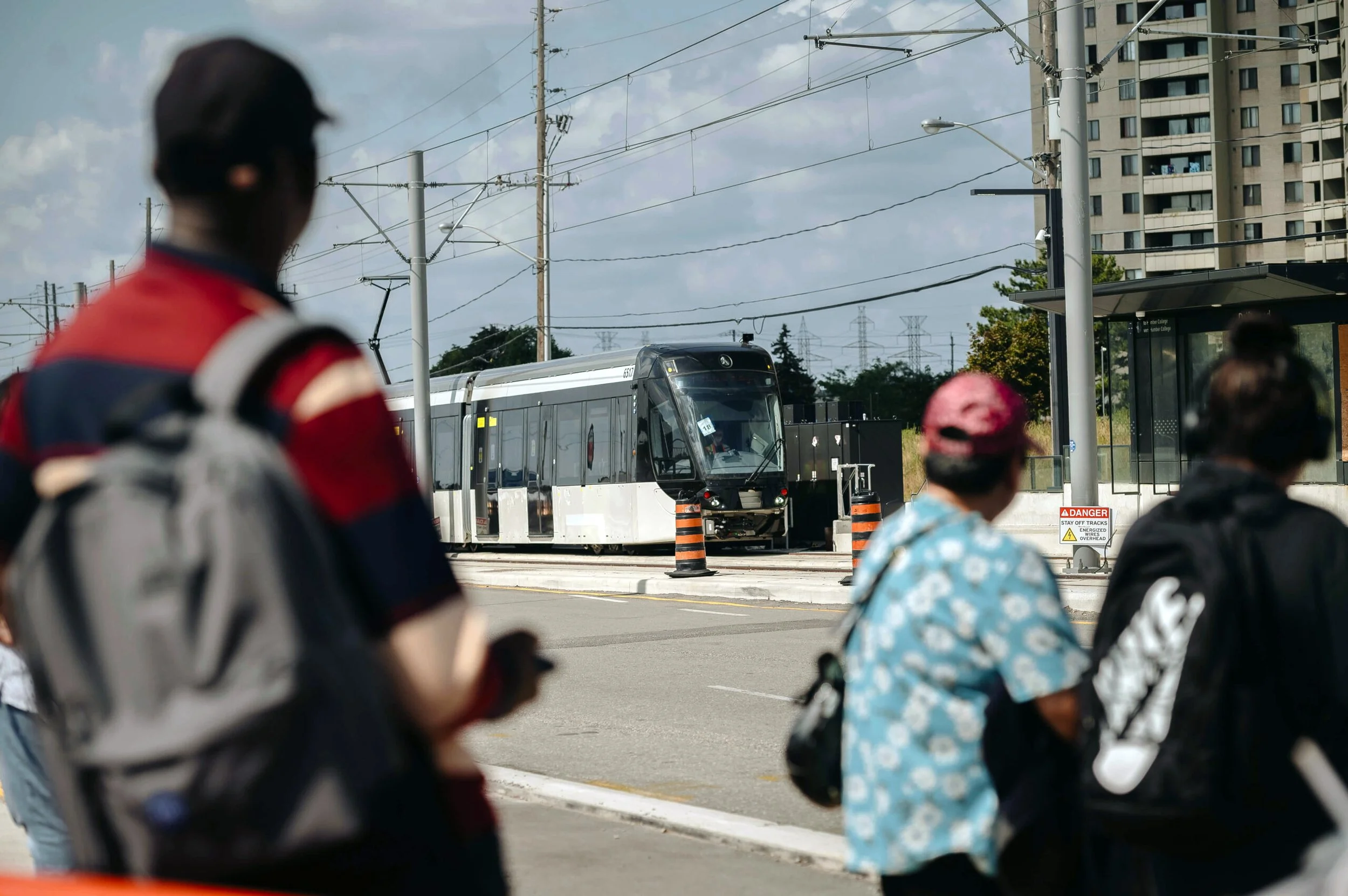
Eglinton Crosstown and Finch West LRT lines Customer Journey Mapping
Eglinton Crosstown and Finch West LRT lines Customer Journey Mapping
Client: Metrolinx
Design Team: Gelare Danaie, Karen Zwart Hielema, David Schellinger, Cody Foo, Bianca Weeko Martin
Project Completion: 2024
With 43 stops across 30 km, The Eglinton Crosstown and Finch West Light Rail Transit (LRT) lines are transformative projects aimed at enhancing public transportation infrastructure in Toronto, Canada. These two lines signify a substantial investment in modern, efficient, and sustainable transit options for residents and visitors.
DEXD was tasked to map out the customer journey of these LRT lines, to ensure they are designed not just as transportation solutions but as holistic experiences that prioritize passenger needs and satisfaction.
Combining station site visits, in-studio research, and community feedback, the DEXD team created five personas to represent future customers for the LRT lines. Mapping out journeys for each persona identified touchpoints such as pain points and moments of delight. These were then analyzed to inform strategic opportunities like the ideal placement of signage to facilitate easy movement through the stations and connections with other modes of transportation.
The findings were then presented to the respective LRT teams at Metrolinx to provide comprehensive insights, including additional information pinpointing deficiencies that could be rectified prior to as well as after the system's public opening. This proactive approach ensured that Metrolinx was equipped with essential data to address any potential issues and enhance the overall performance and reliability of the LRT system before and after its official launch.
By integrating customer journey mapping into the planning and implementation of the Eglinton Crosstown and Finch West LRT lines, Toronto is not only investing in modern and efficient transit solutions but also prioritizing passenger satisfaction and well-being. These projects represent a paradigm shift in urban mobility, where the passenger experience is at the forefront of decision-making, ultimately leading to a more connected, accessible, and inclusive city for all.

The Tenor Building Wayfinding and Signage
The Tenor Building Wayfinding and Signage
Client: BentallGreenOak
Design Team: Gelare Danaie, David Schellinger, Suzan Mecitoglu, Kha Den De/ Lera, Ramin Beyraghdar
Location: Toronto, ON
Project Completion: On-going
Vibrant and Dynamic – The Tenor is embarking on an exciting journey to enhance its signage and wayfinding experience!
Nestled in the bustling heart of Downtown Toronto, The Tenor attracts a substantial flow of visitors every day, necessitating a streamlined wayfinding system. DEXD was tasked to transform the wayfinding in the building to make it accessible and intuitive.
As a starting point, DEXD team has crafted a comprehensive Signage & Wayfinding Report, that investigated existing challenges and presented innovative solutions. The report commenced with a site analysis, during which the DEXD team conducted a site survey, created flow diagrams, and collected information and observations pertaining to navigation within the building. Subsequently, the team benchmarked projects of a similar nature and identified the most prominent wayfinding pain points present at The Tenor. By analyzing these pain points, DEXD identified opportunities for improvement and proposed the kit-of-parts approach for a tailored solution.
Following the initial report, the DEXD team developed and delivered a detailed design package based on the proposed kit-of-parts approach. The new wayfinding system has now been fully implemented at The Tenor, enhancing clarity, accessibility, and the overall visitor experience.

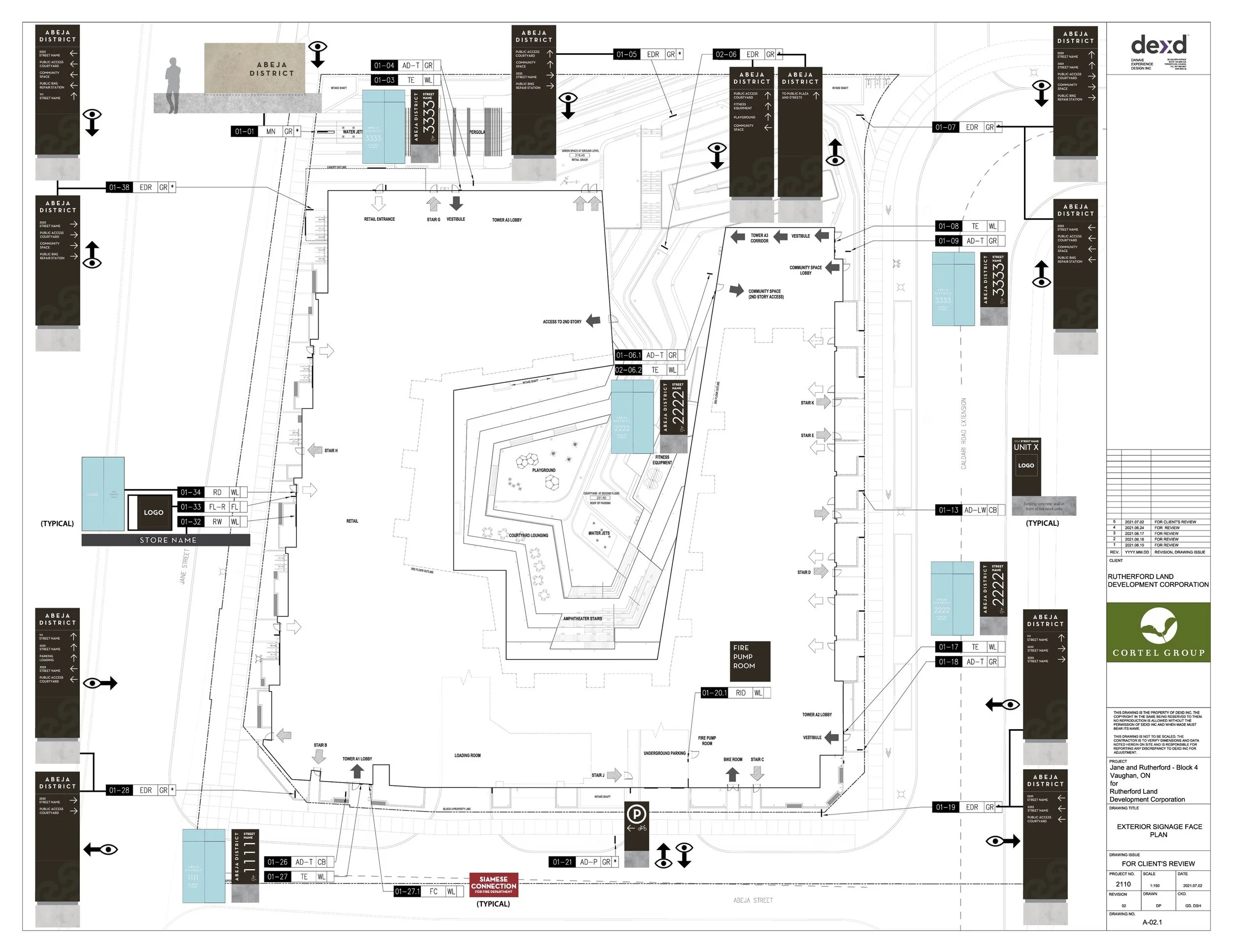
Abeja District Phase Four, Signage & Wayfinding
A master planned community like no other
Photo Courtesy of BDP Quadrangle
Abeja District Phase Four, Signage & Wayfinding
A master planned community like no other
Client: Cortel Group
Design Team: David Schellinger, Gelare Danaie, Daniel Puppin, Karen Zwart Hielema, Matt Ziyaee
Prime Architect: BDP Quadrangle
Project Completion: On-going
The Abeja District Project’s goal is to create a holistic, sustainable community. Located at Jane Street and Rutherford Road, this master-planned development is envisioned as a vibrant hub of life and activity, blending new condos, mixed-use, and commercial spaces into a dynamic urban fabric.
We began our work on the Abeja Wayfinding System for Block Four of the development with three towers, by looking to the larger planning context for the development, encompassing both the parcels under Cortel Group control as well as the surrounding city context.
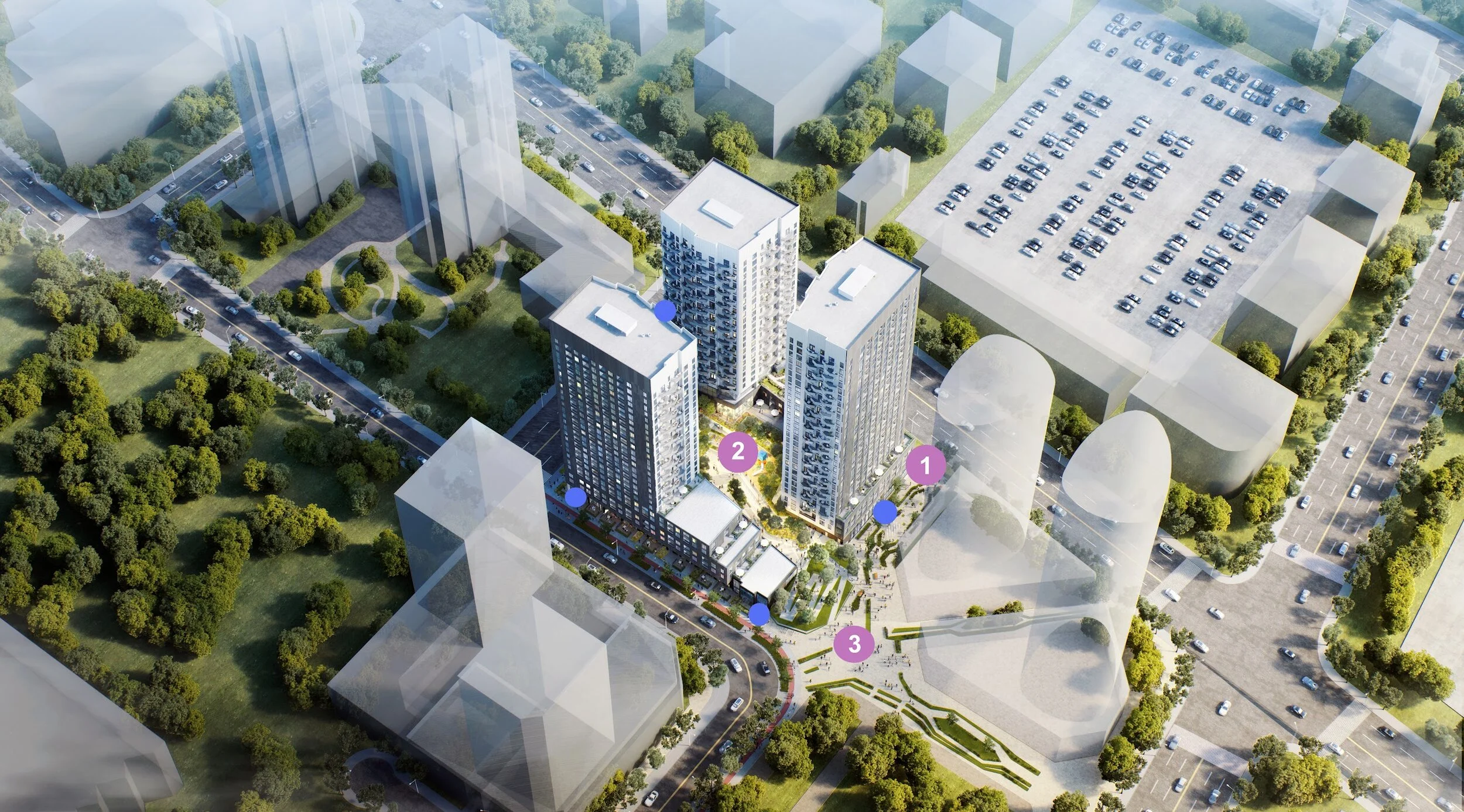
By documenting the expected master flow patterns for various types of users, we can better understand how people come to the site though public transportation or private vehicles, on foot or on bike. These flow patterns then help us to identify decision nodes, where different users and/or modes may come together, which would most benefit from having strong directional signage, branded experiences as well as public art.
Wayfinding Pyramid
We looked at the different routes that people would take to go between each of the nodes and how the wayfinding can be further enhanced through the views to nodes or the addition of signage elements. Lastly, we looked at the type of character that will be found in the collective spaces, to see where we can further enhance the character through branded environments that incorporate, architecture, landscape, signage, and public art all together. These places are identified as opportunities for what we are calling “placemaking”
1. Certainty (Identity and Code Signage)
2. Navigation (Directional Signage)
3. Delight (Monumental Signage, Branded Environments and Public Art)

Wayfinding and Brand
Abeja district block four is designed with a creative architectural theme which is simple, black with clean lines outside and playful light-colored with a beehive balcony looking inside. After a round of design collaboration meetings with the architects, landscape, and the project team, the decision was to keep the wayfinding graphic design as minimal, simple, and elegant as possible.
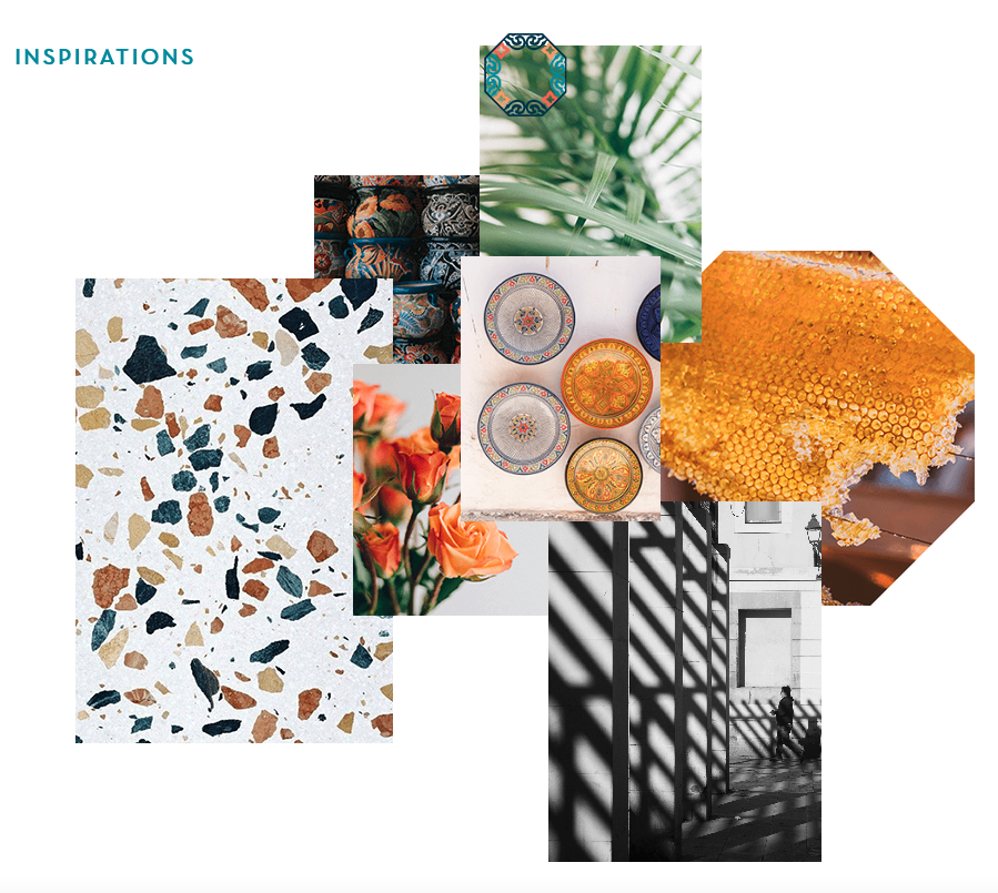
Our first design inspiration comes from the overall exterior look for the building, which is rendered in a darker monotone black/blue palate. As such, our signs work with a matte black color for the base of the exterior signs, with white illuminated messaging for increased legibility.
The exterior signs incorporate abstract elements of the Abeja logo in a tone-on-tone contrast to provide a subtle yet rich level of detail without compromising the elegant nature of the signs overall. For feature signs such as our monument sign along the public right of way, we drew inspiration from the Spanish heritage of the development by incorporating large slabs of Spanish Stone (or other similar stones) that are a signature building material of most Spanish architecture.

The interior design character of the building lobbies are rendered in a playful environment with a colorful and textured pallet. As such, our use of the base black signage works well to help stand out from the visual noise and provide clear focus on the directional messaging as much as possible.


Princess Hollywood Wayfinding
Princess Hollywood Wayfinding
Client: Cortel Group
Design Team: Gelare Danaie, David Schellinger, Suzan Mecitoglu
Prime Consultant: BDP Quadrangle
Location: Vaughan, ON
Project Completion: On-going
Welcome to the Princess Hollywood, a Signage and Wayfinding system for an exquisite development, designed to embrace community creation.
Located north of Highway 7, west of Creditstone Road, and south of Barnes Court, the complex is adjacent to a major transit hub and highway so that residents and visitors can enjoy convenience and accessibility.
To bring the project vision to life, DEXD team studied how various user types access the site. By understanding their arrival processes, we identified key areas where strategic placement of clear directional signage was required.
Mimicking the architectural design's vision
Drawing inspiration from the building's façade, we focused our design on framing the signs and taking cues from the strong grid structure of the building. The frames are strongly expressed and often offset from the sign face, allowing for a very clean and rectilinear look.
Wayfinding and Brand
Finally, we carefully considered physical signage elements like color, materials, typeface, and iconography, taking inspiration from the brand vision and architectural concept. To achieve a clean aesthetic, we opted for subtle colors that complement the raw and soft exterior concrete.
The use of faux wood, inspired by the wood timber beneath the portico, adds warmth and continuity to the design. Typeface and icons were also meticulously selected to show an elegant and sophisticated ambiance, aligning seamlessly with the building's overall identity and brand image.

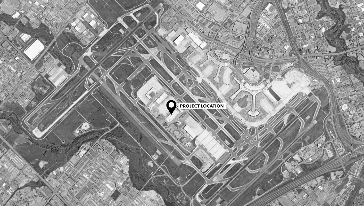
Pearson Airport Terminal 1 Osmow’s
Pearson Airport Terminal 1 Osmow’s
Client: Royalty General Construction Ltd.
Design Team: Gelare Danaie, Daniel Puppin, Ghazal Mehranpooy
Location: Mississauga, ON
Project Completion: July 2023
Toronto Pearson Airport has welcomed its first Osmow's location at the domestic area of Terminal 1. Opening of this popular chain restaurant is part of the airport's commitment plan to provide exceptional services to all travellers.
As a prime consultant, DEXD was tasked to transform the store into a desired place for customers to enjoy Mediterranean cuisine in a convenient manner. Our team ensured a smooth project delivery within a tight schedule by engaging previously established relationships with the client team, the airport authority, and the general contractor, as well as employing knowledge of airport operation structure and experience in working with the GTAA.
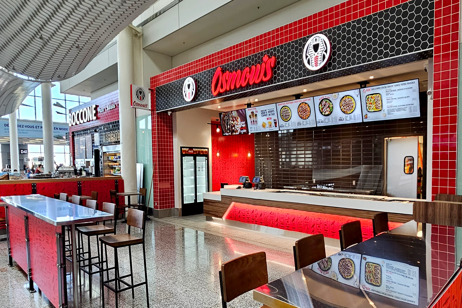
DEXD team provided complete architectural services, including the preparation of Facility Permit Applications for the airport. Throughout the design phase, that started in November 2022, we worked collaboratively with the other consultants to ensure detail coordination. During the implementation phase, completed in July 2023, we supported the construction team by reviewing shop drawings and submittals, as well as responding to RFIs, while keeping the priority of delivering the project within cost and schedule goals.

Abeja District Phase 2 Wayfinding
Abeja District Phase 2 Wayfinding
Client: Cortel Group
Design Team: Gelare Danaie, David Schellinger, Alisson Talancha
Prime Consultant: Turner Fleischer Architects Inc.
Location: Vaughan, ON
Project Completion: On-going

Quadra Ingredient Innovation Center
Quadra Ingredient Innovation Center
Client: Quadra Ingredients
Design Team: Gelare Danaie, Karen Zwart Hielema, Kha Den De / Lera, Alisson Talancha
Location: Oakville, ON
Project Completion: On-going
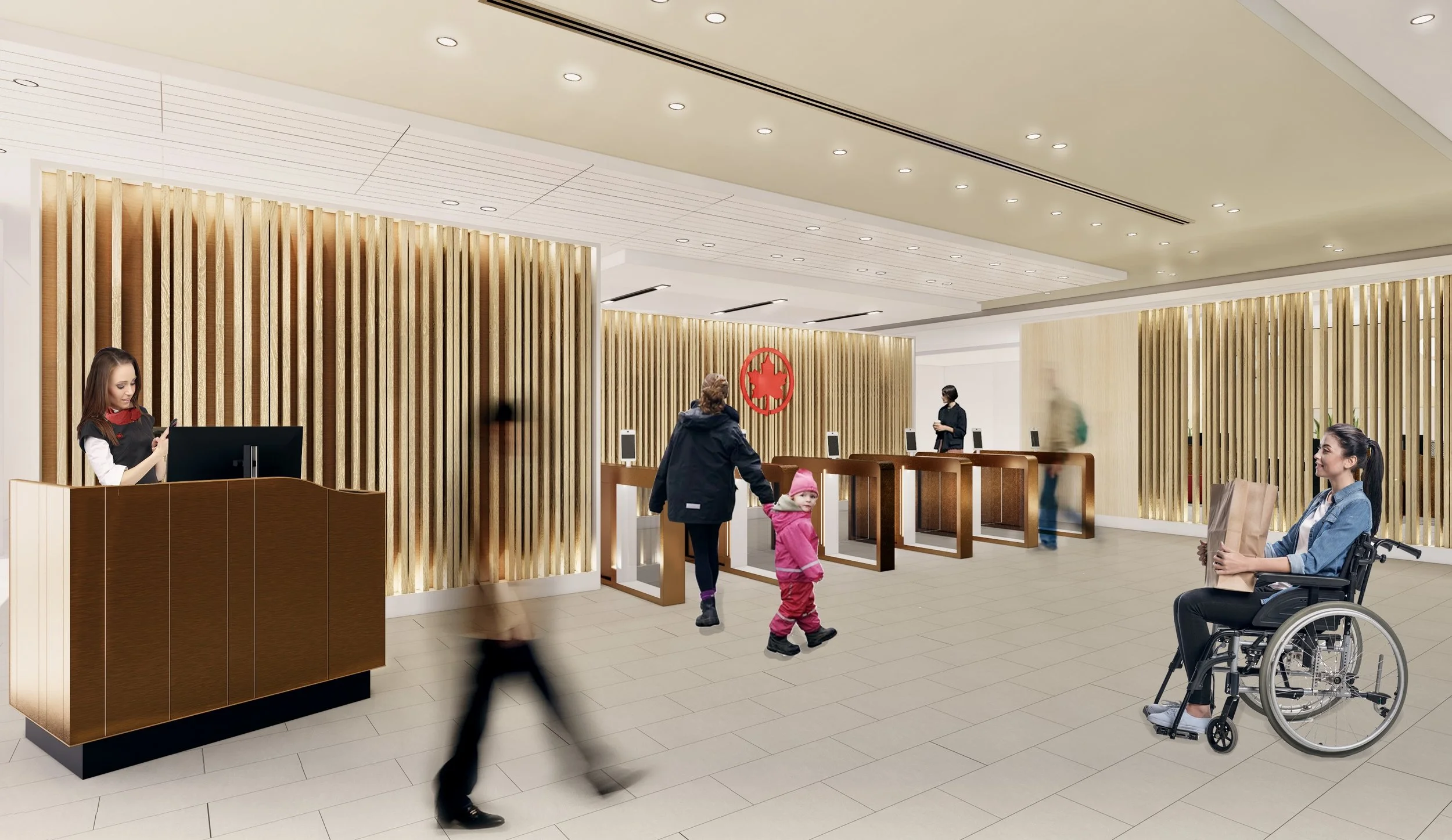
Air Canada Domestic Maple Leaf Lounge E-Gates
Air Canada Domestic Maple Leaf Lounge E-Gates
Client: Air Canada Corporate Real Estate (CRE)
Design Team: Gelare Danaie, Greg Parsons, Karen Zwart Hielema, Daniel Puppin, Ghazal Mehranpooy
Consultant Team:
Code: Elektra Vraches
Mechanical, Electrical, Communications: Quasar Engineering
Structure: Luciano Longo
Size: 1884 square feet
Project Completion: 2023
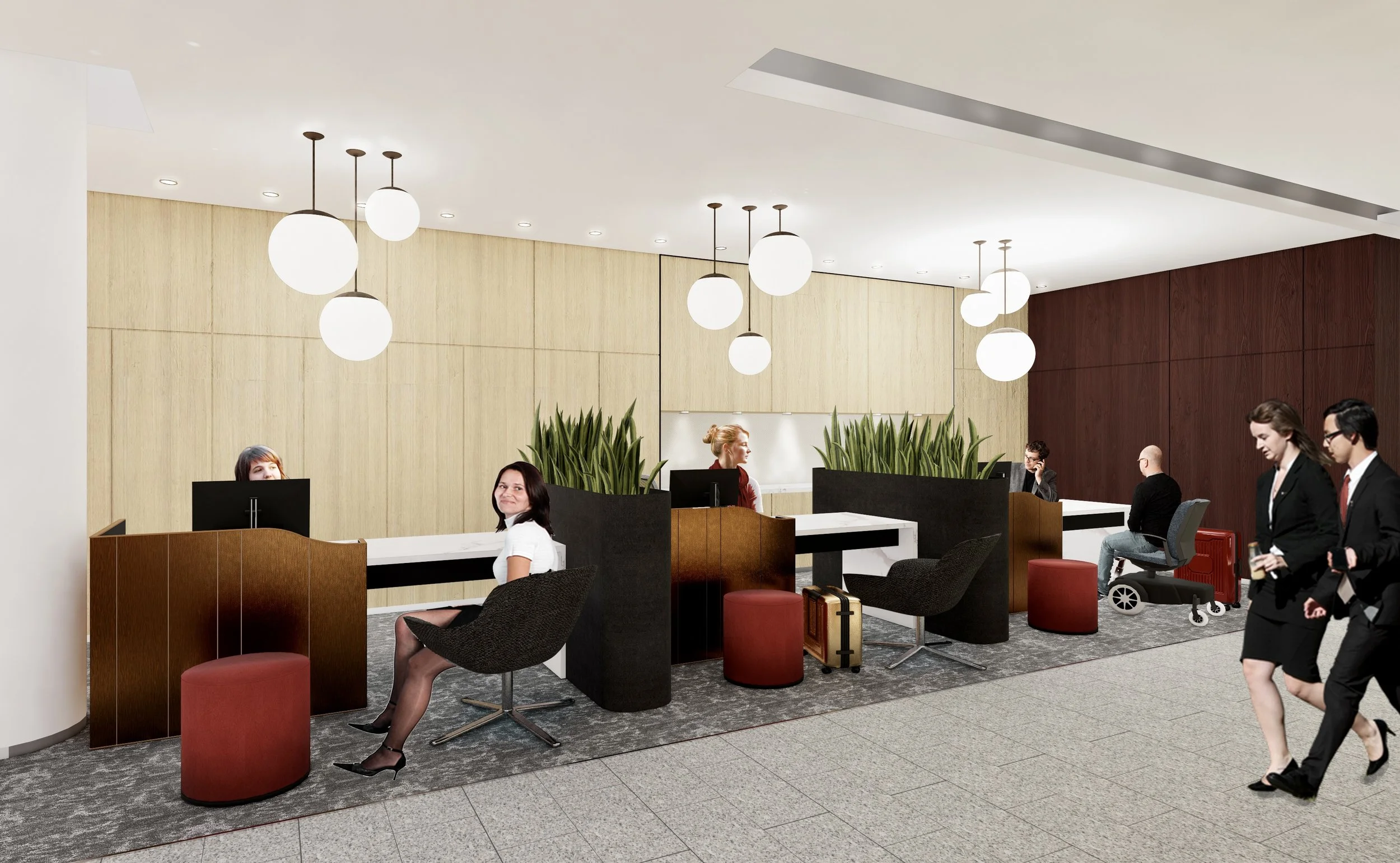
A focus on enhancing the customer journey through targeted enhancements has transformed the Air Canada Domestic Lounge entry sequence into a seamless and human-centric experience.
DEXD unique design approach uses journey mapping to understand customer profiles and needs. Targeted enhancements include the introduction of e-gates to streamline the entry process for lounge guests. Passengers with additional customer service needs are provided with an enhanced customer service desk experience where a more focused and personalized exchange can take place.
These additions create a more welcoming and inclusive environment, enhancing the overall customer experience as well attention paid to the Air Canada staff experience. Detailed design of the customer service agents’ spaces provides them with a comfortable and functional work environment to deliver exceptional assistance to travelers.
Air Canada Transborder Maple Leaf Lounge E-Gates
Air Canada Transborder Maple Leaf Lounge E-Gates
Client: Air Canada Corporate Real Estate (CRE)
Design Team: Gelare Danaie, Greg Parsons, Karen Zwart Hielema, Daniel Puppin, Ghazal Mehranpooy, Suzan Mecitoglu
Consultant Team:
Code: Elektra Vraches
Mechanical, Electrical, Communications: Quasar Engineering
Structure: Luciano Longo
Size: 1722 square feet
Project Completion: 2023
A focus on enhancing the customer journey through targeted enhancements has transformed the Air Canada Domestic Lounge entry sequence into a seamless and human-centric experience.
DEXD unique design approach uses journey mapping to understand customer profiles and needs. Targeted enhancements include the introduction of e-gates to streamline the entry process for lounge guests. Passengers with additional customer service needs are provided with an enhanced customer service desk experience where a more focused and personalized exchange can take place.
These additions create a more welcoming and inclusive environment, enhancing the overall customer experience as well attention paid to the Air Canada staff experience. Detailed design of the customer service agents’ spaces provides them with a comfortable and functional work environment to deliver exceptional assistance to travelers.

Atelier Park Wayfinding
Atelier Park Wayfinding
Client: Cortel Group
Design Team: Gelare Danaie, David Schellinger
Prime Consultant: IBI Group
Location: Vaughan, ON
Project Completion: On-going
The Atelier Park Signage & Wayfinding is a project that captures both graceful design and practical utility that create a smooth customer experience.
Located at the major intersection of Keele Street and Highway 7, Atelier Park is advantageously connected to VMC Subway Station (Vaughan Metropolitan Centre), GO Train line, bus routes, and even pedestrian walkways and green spaces, which outlines the need for clear wayfinding system that would provide clear directions for all users.
DEXD team began the work by producing flow diagrams and documenting expected master flow patterns, which then allowed us to identify decision nodes that would most benefit from having strong directional and/or branded signs, as well as identify best locations for address signs that would be easily pinpointed by users.
Architectural Patterning
As part of our design exploration, we looked into pattern expression and its storytelling potential.
Drawing inspiration from Atelier Park's brand vision that conceptualizes Atelier as designer's workshop or studio, we examined the idea of suit fashion, particularly referring to suit lining. Patterns we considered ranged from subtle but sophisticated to strong and bold-colored. The final design is inspired by the first building to be built within the proposed complex, and its angled faceted elements that run the height of the building facade.
Wayfinding and Brand
Although our design inspiration comes from the brand vision and architectural design, we built on the concept and proposed new colors that would pair nicely with initial brand palette. Typeface and icons were also meticulously selected to match overall elegant feeling of the building and brand.

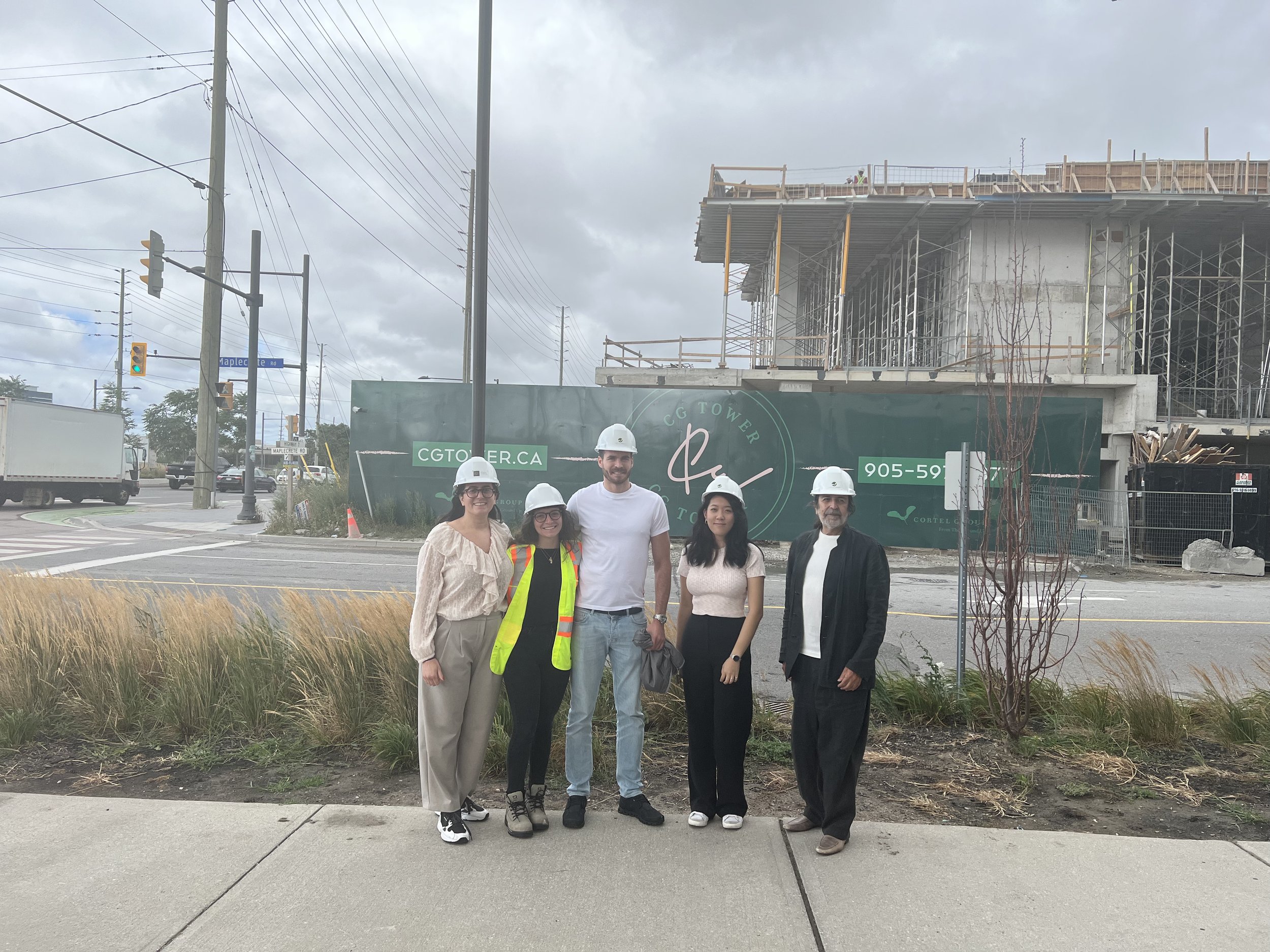
CG Tower
Public art at the heart of the Vaughan Metropolitan Centre.
Expo City CG Tower Public Art
Photo courtesy of BDP Quadrangle
Client: Cortel Group
Design Team: Karen Zwart Hielema, Gelare Danaie, Daniel Puppin,
Prime Architect: BDP Quadrangle, DTAH Landscape Architect
Project Completion: On-going
Summer 2022
Artist Team Alan Tregebov and Joanne Heinen have been mentoring Kha Den De (Lera) during part of the design process for the new public artwork at CG Tower. were selected to provide a public artwork for the CG Tower site as part of the City of Vaughan Public Art Program. Previous works includes Street Light, and The Poet, The Fever Hospital together with the late artist Bernie Miller.
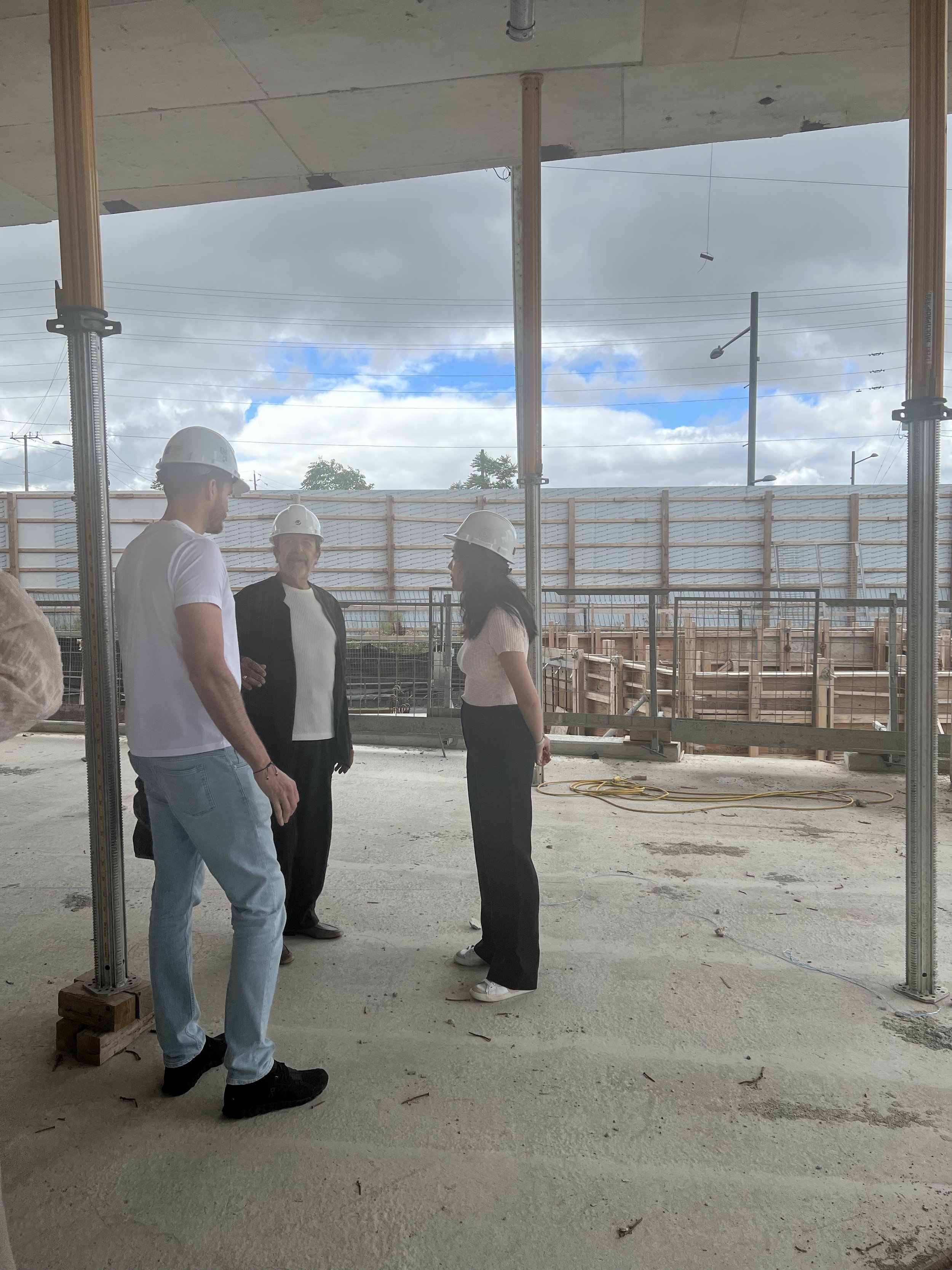
CG Tower main floor looking out to sculpture location. From l-r, Peter Cortelluci, (Cortel Group), Alan Tregebov (artist team), Lera (artist mentee)
Fall 2021
A new piece of public art is coming to the heart of the Vaughan Metropolitan Centre. Located near the intersection of Highway 7 and Jane Street, this piece will tell a story of transformation and speak to the unique identity and history of the Expo City neighbourhood. The artwork will be at CG Tower, the fifth and final element of Expo City by Cortel Group. The site overlooks Edgeley Pond and Park and provides an exceptional opportunity to elevate the public realm at a gateway entrance to the largest urban park for the new downtown. Stay tuned as this story unfolds!


Under Construction, Fall 2024

GTAA Landside Security Mitigation Signage and Wayfinding Project
GTAA Landside Security Mitigation Signage and Wayfinding Project
Client: GTAA Toronto Pearson
Prime Consultant: Arup Cananda Inc.

Sept-Iles Airport
Airport as a Community Space
Airport as Community Space - A Meeting Point Between Two Cultures
Project: Sept-IIes Airport - Sept-IIes, Quebec.
Client: Public Works and Governmental Services Canada (PWGSC)
Design Team: Gelare Danaie, Pedro Andrade, Matt Ziyaee
Consultant Team: Stantec Engineering
Size: 65,440 square feet (6,080 sqm)
Project Completion: 2019
With a change in passenger numbers and airline traffic, it was necessary for the Sept-Îles Airport to rethink the demands which resulted in infrastructure upgrades as well as improvements that enhanced the customer passenger experience. Operating on the northern shore of the St. Lawrence River, Sept-Îles Airport is located a short distance from the main city of Sept-Îles.
The city is home to over 25,000 residents, consisting of both a proud and growing Innu and European community. As a significant meeting point, these two distinct cultures formed the inspiration for the narrative of the design concept.
Critical to the vision of the project, was the importance of enhancing the customer experience along the journey. Developing intuitive wayfinding and implementing strategic decision making points were mapped along the entire customer journey for both arriving and departing passengers.
Each interaction along the customer journey, from check-in, baggage drop, security gates, baggage pickup, and curbside pickup were carefully explored with various stakeholders and user groups. For each step of the process, the goal was to create a clean and uncluttered environment where passengers are able to easily navigate their way, with clear sightlines and minimum use of textual language.
The reliance of merging infographics and art helped reinforce and convey the concept of a "meeting point between two cultures."
Supporting the airport requirements as a community and meeting destination, the team implemented a multifunctional hall on the second level for the purposes of hosting cultural events and community gatherings in a unique setting.
Other enhancements including fostering connections between the interior and exterior were explored, where access to daylight and views benefited a customer’s orientation and well-being. These improved connections created more opportunities for passengers to view the apron activity and beyond, creating unique and memorable experiences.

Air Canada Cargo
Branded Environments
Branded Environments
Project: Air Canada Cargo CHIP, Head Offices – Mississauga, Ontario
Client: Air Canada Corporate Real Estate (CRE)
Design Team: Gelare Danaie, Greg Parsons, Matt Ziyaee, and Pedro Andrade
Consultant Team: Quasar Engineering
Size: 43,227 square feet (4,016sqm)
Estimated Completion: In progress / 2021
The DEXD team was awarded to redesign the existing Air Canada Cargo CHIP head offices located at Toronto’s Pearson International Airport. Located on the third level of the main Air Canada Cargo building, the overarching goal was to consolidate and create an open and collaborative workplace environment with flexible meeting spaces maximizing efficiencies.
Early engagement sessions with our client and the various stakeholders included establishing and finalizing programming requirements, facilitating user group meetings, leading design charrettes, while managing project delivery and timelines. Early engagement with our Engineers was helpful in establishing extent of work and potential impacts to both schedule and construction budgets.
Several planning options including hybrids were presented for the purposes of generating discussion. Solutions included flexible social areas of collaboration, dedicated spaces for workshops /meetings, and quiet zones for those performing tasks requiring concentration.
Integral to the overall design experience, DEXD was given the opportunity to showcase and celebrate the history and future growth of the Cargo division and its valued employees.
Our approach to storytelling began by strategically implementing oversized graphics throughout the space, helping to convey our clients story to its stakeholders in the form of a meaningful and memorable experience. A simple, minimalistic approach was taken and where the brand was prioritized to have the greatest impact.