DESIGN BLOG
Thoughts
&
Musings
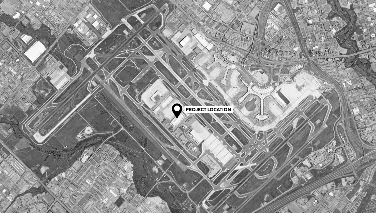
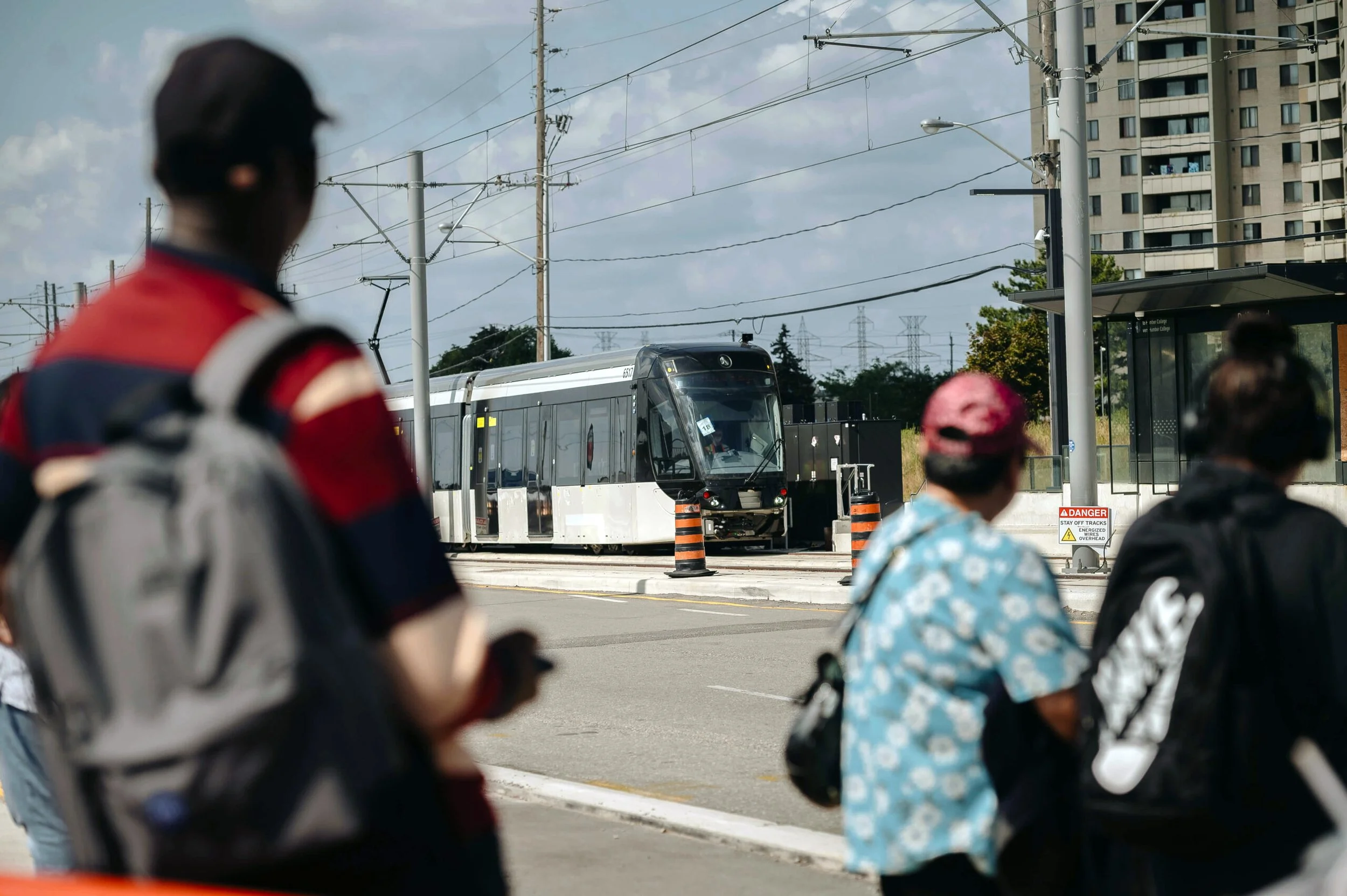
Making the System Work: Wayfinding for the Scarborough Subway Extension
By Karen Zwart Hielema
Image courtesy of Metrolinx
I love it when systems work well – when they are clear and efficient. With every sign that we place in a transit station, our goal is for a seamless passenger journey. Sometimes the architecture facilitates wayfinding, and a sign is not needed!
The DEXD team has been awarded a role as wayfinding and signage consultants as part of the larger delivery team for Scarborough Subway Extension. This marks our second large-scale transit project in Canada, and we’re thrilled to bring our expertise in human-centered design and intuitive wayfinding to this global team of experts including SENER, DIALOG, and GUNN.
A subway line is more than just a line—it’s a vital transportation system that stitches the fabric of a city and keeps our communities connected. The line will extend Toronto's Line 2 subway by 7.8 km, connecting with more than six transit options across the city. This expansion will replace the Scarborough RT (Line 3) and help reduce travel times while improving access to jobs, schools, and other destinations in Toronto. An image can speak a thousand words, but there are numbers that carry deep meaning. Consider the impact this line will have:
Ridership: 105,000 daily boardings
Increase in transit use: 52,000 daily
People within walking distance: 38,000
Access to jobs: 34,000
Annual reduction in greenhouse gas emissions: 10,000 tonnes
Delivering large-scale, complex projects can sometimes make it easy to lose sight of the broader importance of our work as we navigate through daily tasks, submissions, and technical reviews. But it’s important to remind ourselves that at the heart of every professional involved in a public project is a passion for doing good for the community. It’s about working toward the mission of creating collective joy and building spaces where everyone’s quality of life improves.
That’s why, with every sign we place in the subway systems, we are one step closer to fulfilling the mission of our company: creating spaces that enhance people’s lives.
Congratulations, DEXD team!
Intuitive Wayfinding Design at University of Toronto Scarborough: MBG Health Sciences Complex
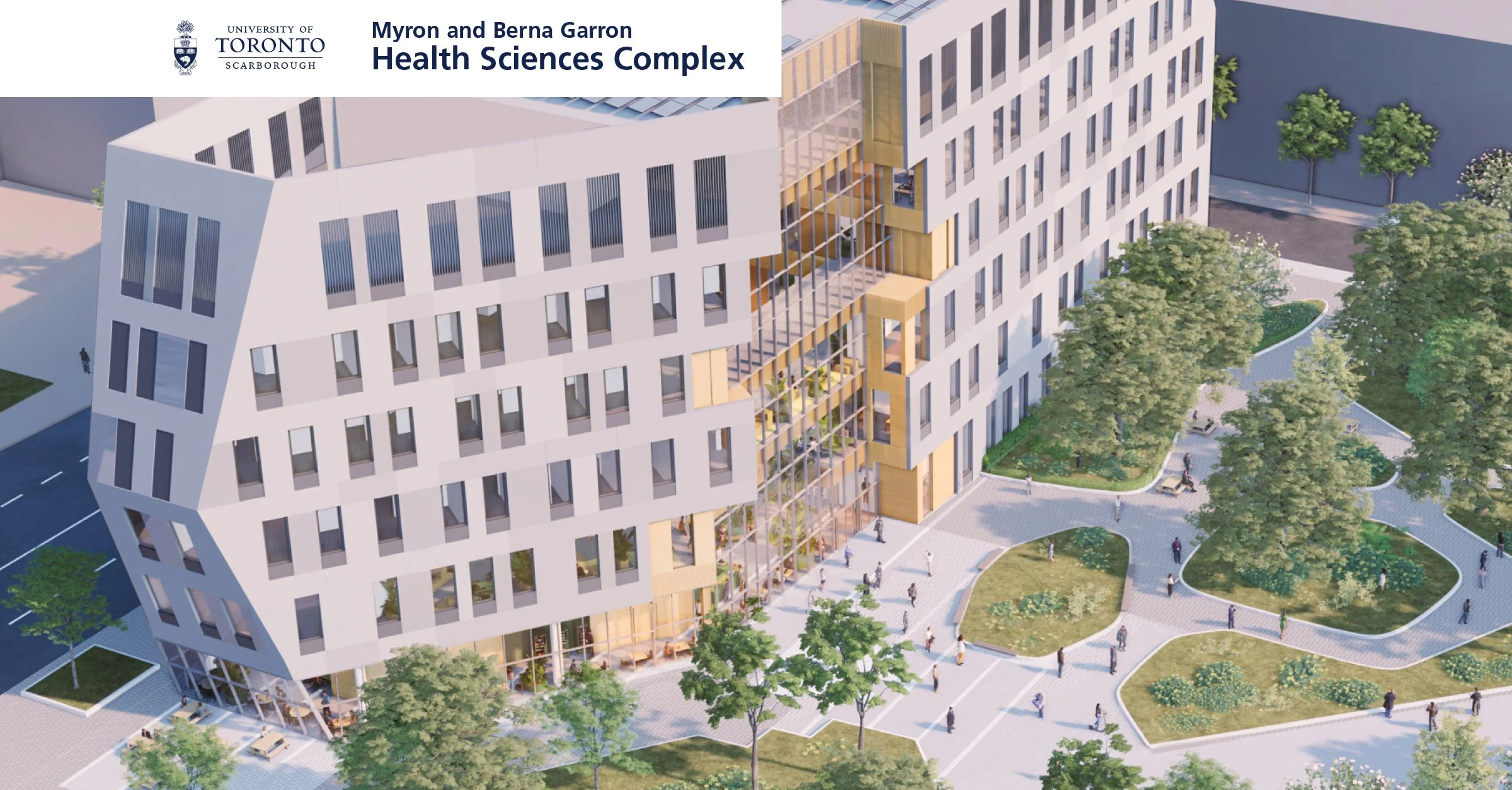
Artist Rendering, Image Courtesy of Diamond Schmitt Architects and MVRDV
DEXD team has been selected as wayfinding and signage consultant for the University of Toronto Scarborough. Our team has been working closely with EllisDon, Diamond Schmitt & MVRDV. The Scarborough Academy of Medicine and Integrated Health at the University of Toronto Scarborough serves as a welcoming centre for education and fosters relationships between local healthcare professionals. The campus houses education programs including Graduate Department of Psychological Clinical Science, Department of Health & Society, Temerty Faculty of Medicine, Lawrence Bloomberg Faculty of Nursing, and Leslie Dan Faculty of Pharmacy. Includes a dedicated Clinic and Pharmacy for the public.
Collaboration with such a prestigious and Canada's number one institution is an incredible opportunity, and we will our creative ideas and the fresh approach to Customer Experience Design to the team. Our approach is to create a system for information and placemaking elements including the donor’s recognition design elements in a holistic approach. Our goal is to be consistent, improve the student, faculty and public experience, and strengthen the university's brand. The design philosophy is to start with Customer Journey Mapping and identify the key decision making points. The strategic positioning of directional and identification signage at decision points, junctions, and entrances are coordinated in weekly meetings with architect of record. We have considered the campus's size, complexity, different user needs, and future development in mind.
The primary advantages of this technique are easier navigation, increased safety, a positive customer experience, and a strengthened brand identification.
Our approach to wayfinding and information design system is “Less is more”. We believe good architecture, same as this building, is intuitive by nature and we are helping and supporting the design team to further refine the navigation system without over powering the space with multiple wayfinding elements.
Stay tuned for updates as we continue on our journey.
Typographic Matchmaking
Bridging Arabic and Latin Scripts in the Gulf Cooperation Council (GCC) Region
Written by Majid Abbasi
Edited by Suzan Mecitoglu

Typography is more than just letters on a page; it is a tool for communication, navigation, and inclusivity. In the Gulf Cooperation Council (GCC) Region, where Arabic and Latin scripts coexist, designing effective bilingual wayfinding systems is both aesthetic and functional. Each script presents unique challenges, from differing alphabets to the opposite writing directions of Arabic (Right-to-Left) and Latin (Left-to-Right). Addressing these complexities is crucial to fostering inclusivity and accessibility.
Thoughtful integration of Latin script with Arabic creates a harmonious visual system that bridges communication gaps and ensures effective bilingual communication for residents and visitors alike.

Wayfinding systems in the GCC Region must cater to both Arabic and Latin readers, and the contrasting directional flows of the two scripts require careful design considerations. Type size, alignment, and spacing need to be adjusted to ensure readability without compromising the aesthetics of either script. When these elements are not thoughtfully addressed, mismatched or poorly designed typefaces can disrupt the flow of navigation, create visual dissonance, and hinder accessibility in public spaces like airports, shopping centers, and transportation hubs.
This is why typographic matchmaking—harmonizing Arabic and Latin scripts—is critical. Typography is not just about aesthetics; it is about creating connections, improving accessibility, and enhancing user experience. By prioritizing consistency and clarity, designers can deliver wayfinding systems that meet the needs of a diverse audience.

At DEXD, we understand these challenges. Our team of experts in Arabic and Latin typography will lead the way in designing bilingual wayfinding systems tailored to the unique needs of the GCC Region. To further advance this field, we are proud to announce the creation of a professional panel dedicated to typographic matchmaking. Through this initiative, we aim to share insights, set standards, and foster collaboration among designers and typographers across the region.
By addressing the challenges of combining Arabic and Latin scripts, we can ensure that wayfinding systems in the GCC Region are not only functional but also inclusive and beautiful. Together, we can design for a future that connects people and cultures through thoughtful, innovative typography.
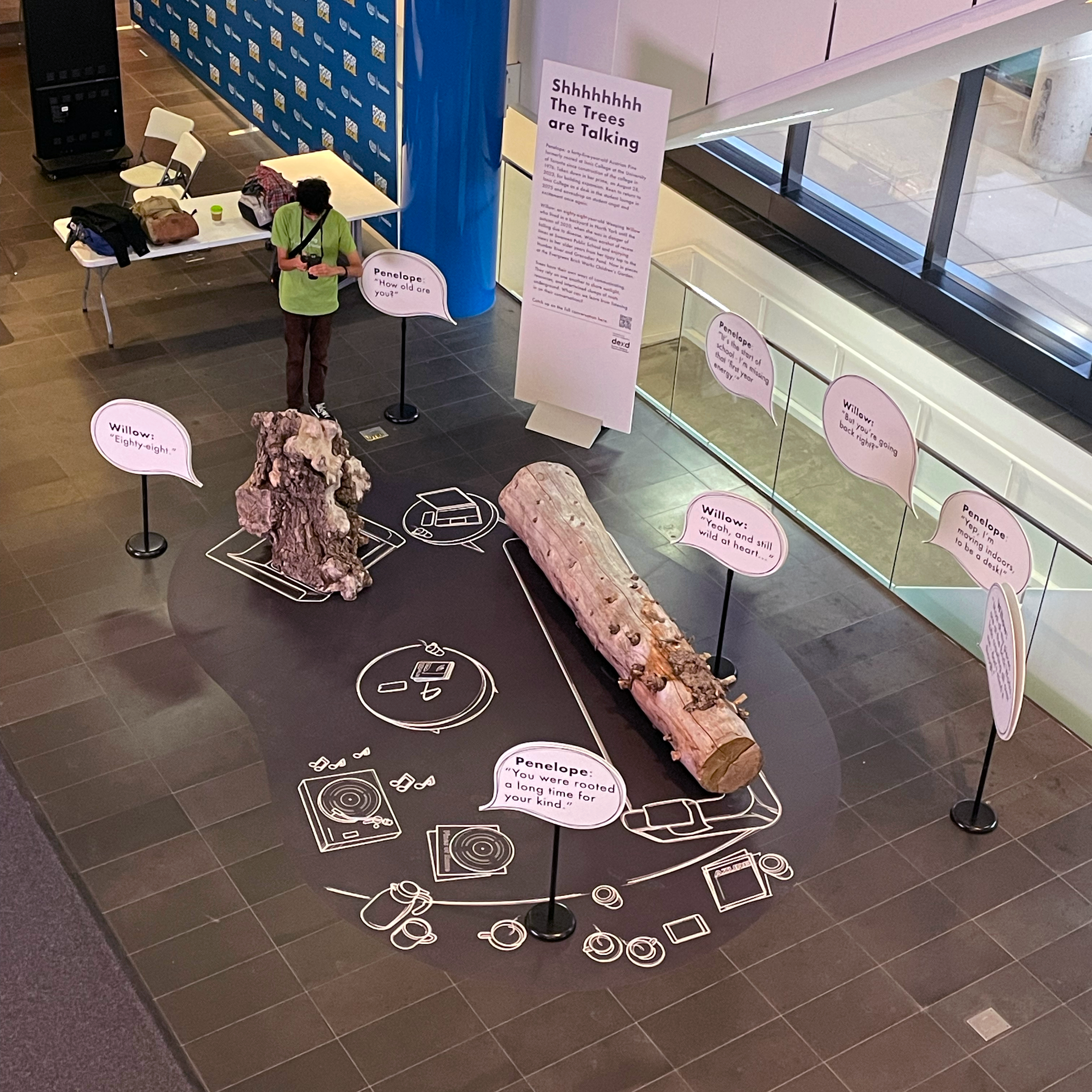
Shhhhhhh The Trees are Talking
Project: AZURE Human/Nature Conference
Climate Change Mitigation in Architecture and Design
Client: AZURE Publishing
Customer Experience Design Team: Gelare Danaie, Karen Zwart Hielema, Bianca Weeko Martin, Majid Abbasi, Ramin Beyraghdar
Project Completion: October 2024
Penelope: a forty-five-year-old Austrian Pine formerly rooted at Innis College at the University of Toronto since construction of the college in 1976. Taken down in her prime, August 28, 2023, for building expansion. Keen to return to Innes College as a desk in the student lounge in 2025 and eavesdrop on student angst and contentment once again.
Willow: an eighty-eight-year-old Weeping Willow who lived until diseased and in danger of falling in a backyard in North York until the Autumn of 2020. Within earshot of recess times at Swansea Public School and views in her older years from her tippy top to the Humber River and Grenadier Pond. Now in pieces at the Evergreen Brickworks Children’s Garden.
Trees have their own ways of communicating. They rely on one another to share sunlight, resources, and intertwined clumps of roots underground. What can we learn from listening in on their conversations?
Penelope lounges on the sofa in the conference room, opens her eyes and discovers another tree. “Hey there!”
Willow looks at her with curiosity. “Hello! I think I know you from across the wood lot, right? … out in Scarborough.”
Penelope didn’t recognize her; she was used to seeing that gnarly side of hers. “Hmm… you’re Willow?”
Willow nods, readjusting her position. “Trees invited to a human/nature conference. Who would have thought it possible! Thank goodness for complementary tickets. I heard they were expensive.”
Penelope stretches her back. “What’s it called again?” “Human – Nature?” “I think they’ll be talking about how we can work together.”
Willow sighs, “I don’t trust these humans, they just talk!”
Penelope sips her coffee. “Well, I took a look at the speaker line up and they’ll be talking about some pretty cool projects.”
“Yeah, but even so - all they talk about is themselves, human-centered design! What about us?”
“Oh, come on Willow, not all of them. They’re learning. Slowly.” She eyes the book in front of Willow, Margaret Atwood’s ‘Old Babes in the Wood: Stories’. She recalls how other trees talked about Willow’s wisdom.
Willow sets down her cup. “You still have that young optimism. How old are you?”
Penelope is a little giddy. “Well yeah, I’m young. I was rooted for 44 years. And have been hanging out on the wood lot for another year. In pieces, waiting ...”
“Ouch! That's not long to be growing – what happened?” Willow thinks how Austrian pines can grow to 500 years, only 44.
Penelope tells her that humans needed to expand the building, and she was in the way. Suddenly she gets excited, “But I’m going back - imagine! I’m moving indoors, to be a desk!”
“Interesting... most of my pieces are at the brickworks, kids crawling all over me - don’t mind it though.”
“You are such a grandma! How old are you?”
“Eighty-eight.”
“Wow, you were rooted a long time for your kind,” exclaimed Penelope. “Weeping Willows usually top out their growth years around 70.”
“Yeah, longer than expected, and I’m still around, still wild at heart.” She winks.
Penelope laughs, “So we live on – what did they call it? … circular economy?”
Willow grudgingly admits. “They really need us, don’t they?”
Penelope listens to music, Joni Mitchell’s ‘Both Sides Now’, sees people in the conference as she speaks softly, “I can remember the animated conversations under my canopy…. couples embracing, students chilling as I worked my magic.”
“Oh, I can relate.” sighed Willow “The family that grew up under my branches had the most relaxed outdoor meals in my shade,” she remembers the urge to hug them – good memories.
“Ok, so you’re not so skeptical anymore,” said Penelope finishing her coffee.
“Mmmm... we trees and humans are deeply connected - we just need to listen to each other.”
Why do I love airport design?
Written by Gelare Danaie
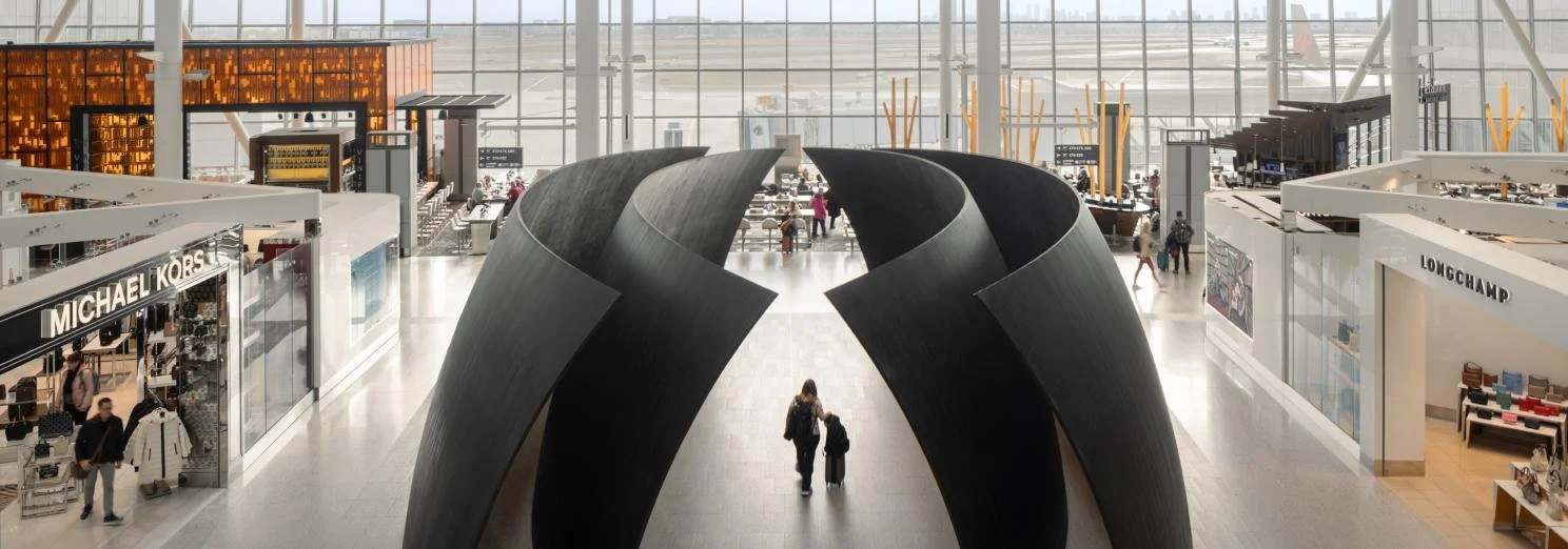
Image courtesy of Pearson Airport, Lift Program
I’ve been in the business of designing airports, train stations, and subways for a long time now. I guess the reason I chose this career path is that from a young age, I’ve been passionate about flying, traveling, and transportation—or better yet, transformation. Guess what? I used to paraglide in my twenties! But when I think more deeply, I can find other reasons for my passion for airports.
#1 Emotional design
I believe airports are emotional places. From the moment we start our journey, we are both excited and stressed. We think about what can go wrong and dream of arriving at our destination; joy and panic are intertwined. Remember, we are still the same species that weren’t meant to fly. Flying is transformational.
#2 Time as an ingredient of design
Nowhere more than in an airport do we need to work with time—time as an ingredient in our design. What services, amenities, places, and experiences can we offer to bring joy back to air travel? How can we account for the ever-changing nature of airports and design something extraordinary yet flexible? In the aviation world, nothing stays the same, even in a year, let alone over the timeline of a project. The challenge is to consider time as one of the key ingredients of design.
#3 Gateway
Airports are the gateway to a place, forever associated in people’s memories as the first impression of a location. We need to find and design that character. Our team at DEXD is part of the consulting group for Pearson International Airport’s Terminal 1 and Terminal 3 Revitalization Program. Our design mandate is to create a space that is “Local and Inspiring,” reflecting the character of the region we call home. We ask ourselves: what is the essence of Toronto and the Golden Horseshoe as a place?
Now, let’s put all three ingredients together: emotions, time, and character. You’ll agree with me that designing an airport is similar to writing a novel—complex and fun!
Read more about Pearson Airport Lift Program.
"Mission: Possible"
Written by Gelare Danaie
After 20+ years in architectural practice, traveling, experiencing life, and observing the connections between people and places, I realized what truly important to me is to be able to impact everyday life by designing spaces for people, and to challenge the top down approach of architectural practice.
Although the experiential design layer is the first impression for people, harmonizing and managing its elements is usually a tricky task for architects. Having the experience of being an architect in charge of managing the consultants in a large scale project, I realized there is a gap in the practice of overseeing all the public facing elements that include wayfinding, environmental graphic design, digital communication, advertising, activation, and art.
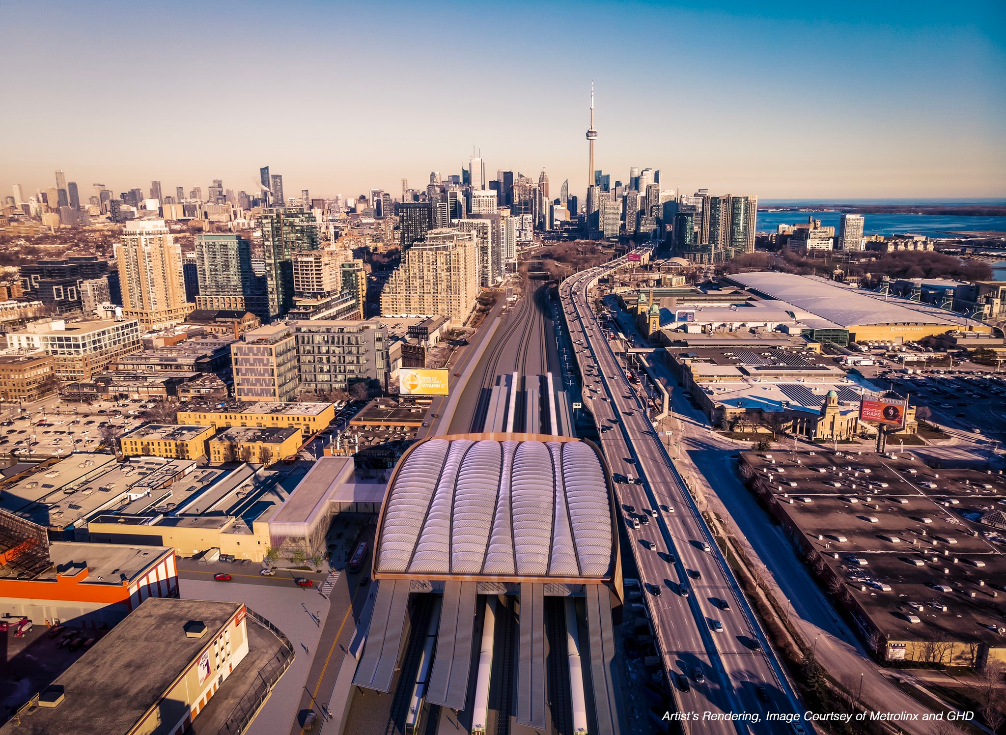
This is how DEXD came to life. I decided to create a platform that would combine architectural planning and experiential elements in complex environments. Our first major contract was Metrolinx Subway Station Architecture Design Standard. The mandate was to prepare a design standard for all the subway stations within GTHA area, the most important project being Ontario Line South!
While working with Metrolinx back in 2020 and as we were mapping all the architectural typologies of stations for the future line, I opened my personal notebook and wrote down my vision with a sharpie pen: «DEXD will be the Wayfinding designer for the line!»
Fast forward to 2023, my phone rang on a Friday afternoon in August and I got the news that we were chosen as the Wayfinding consultant for all Ontario Line South stations.
I believe business and life are similar, there are lots of ups and downs, wins and losses, but if you have a vision, you share your true values, and put all your heart in what you do, there is a big chance you will achieve what you want.

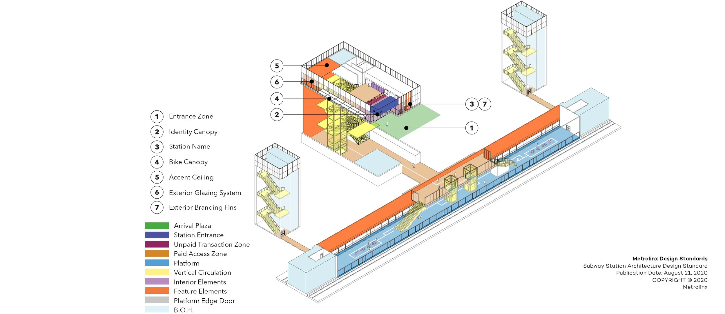
Metrolinx Subway Station Architecture Design Standards
A Comprehensive Standard for the Future of Transit
A Comprehensive Standard for the Future of Transit
Client: Metrolinx
Design Team: Gelare Danaie, Greg Parsons, Karen Zwart Hielema, Pedro Andrade, David Schellinger, Alireza Atarian, Stephen Read, Matt Ziyaee
Urban Realm Consultants: Stantec; gh3
Consultant Team:
Mechanical, Electrical, Communications: Quasar Engineering
Code: Senez Company
Acoustics: Thornton Tomasetti
Industrial Design: Yellow Window
Specifications: DGS Consulting
Project Completion: November 2020
Within a of strong field of both local and international design competition, DEXD was the successful proponent and awarded the new Metrolinx Subway Design Standard RFP.
At the beginning of the Covid 19 Pandemic, and under an aggressive and demanding schedule, the DEXD team was confident in delivering a robust, measurable, and enforceable Standard, while focusing on enhancing the customer experience and contributing towards transforming the transportation experience across the Greater Toronto Area (GTA).
As the current transportation network within the GTA expands at a rapid pace, it remains critical to ensure the customer is able to get to their destination quickly, efficiently and safely.
With the many modes of transportation and their various interfaces, user consistency was a key component when evaluating the standards document.
Our approach to the project began by first immersing our team towards understanding the many transit user profiles, understanding their expectations, theirs challenges, while focusing on a human centric design methodology.
Weekly scheduled meetings with our client allowed us to connect regularly, where we were able to listen, learn, share, trust, and truly collaborate albeit in a virtual environment.
With the vast array of stakeholders and their wealth of knowledge and transportation experience, we were able to successfully navigate, discuss, and implement an exhaustive list based on stakeholder feedback.
After a rapid 11 week turnaround of developing and sharing a variety of visual content at scheduled milestones, the DEXD team was successful in delivering a comprehensive and vigorous standard, that will be significant towards contributing towards meaningful design and positively impacting the human experience.


Union Station Bus Terminal Public Art Project
‘On the Road’ is a series of 15 aluminum figures that speak to the universal experience of travel.
‘On the Road’ adds playful narrative to the Union Station Bus Terminal
Client: Metrolinx
Design Team: Karen Zwart Hielema, Gelare Danaie, Pedro Andrade
Artist: Anna Passakas and Radoslaw Kudlinski of Blue Republic
CIBC Square Architects: Wilkinson Eyre Architects, Adamson Associates Architects
Project Completion: November 2021
‘On the Road’ is a series of 15 aluminum figures that speak to the universal experience of travel. These figures are bold, colourful, and organic in form, in contrast with the neutral colour palate and rectilinear nature of the Union Station Bus terminal at 81 Bay Street in Toronto.
Take the time to explore these figures while waiting to catch your bus and you will find yourself reflecting on your own travel experiences and adventures.
As the public art consultant DEXD managed the entire process of artist selection, jury sessions, technical reviews, and the installation of the final work.

The installation of the artwork took place over the course of three days in November 2021. The figures were affixed directly to the glass panelled wall by a team of six.
Metrolink Blog: New Artwork Aims to Further Transform Union Station
Metrolink Blog: New Video Shows Artwork Going Up at Union Station
Eglinton Crosstown and Finch West LRT lines Customer Journey Mapping
Eglinton Crosstown and Finch West LRT lines Customer Journey Mapping
Client: Metrolinx
Design Team: Gelare Danaie, Karen Zwart Hielema, David Schellinger, Cody Foo, Bianca Weeko Martin
Project Completion: 2024
With 43 stops across 30 km, The Eglinton Crosstown and Finch West Light Rail Transit (LRT) lines are transformative projects aimed at enhancing public transportation infrastructure in Toronto, Canada. These two lines signify a substantial investment in modern, efficient, and sustainable transit options for residents and visitors.
DEXD was tasked to map out the customer journey of these LRT lines, to ensure they are designed not just as transportation solutions but as holistic experiences that prioritize passenger needs and satisfaction.
Combining station site visits, in-studio research, and community feedback, the DEXD team created five personas to represent future customers for the LRT lines. Mapping out journeys for each persona identified touchpoints such as pain points and moments of delight. These were then analyzed to inform strategic opportunities like the ideal placement of signage to facilitate easy movement through the stations and connections with other modes of transportation.
The findings were then presented to the respective LRT teams at Metrolinx to provide comprehensive insights, including additional information pinpointing deficiencies that could be rectified prior to as well as after the system's public opening. This proactive approach ensured that Metrolinx was equipped with essential data to address any potential issues and enhance the overall performance and reliability of the LRT system before and after its official launch.
By integrating customer journey mapping into the planning and implementation of the Eglinton Crosstown and Finch West LRT lines, Toronto is not only investing in modern and efficient transit solutions but also prioritizing passenger satisfaction and well-being. These projects represent a paradigm shift in urban mobility, where the passenger experience is at the forefront of decision-making, ultimately leading to a more connected, accessible, and inclusive city for all.

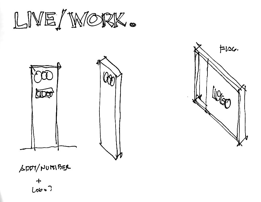
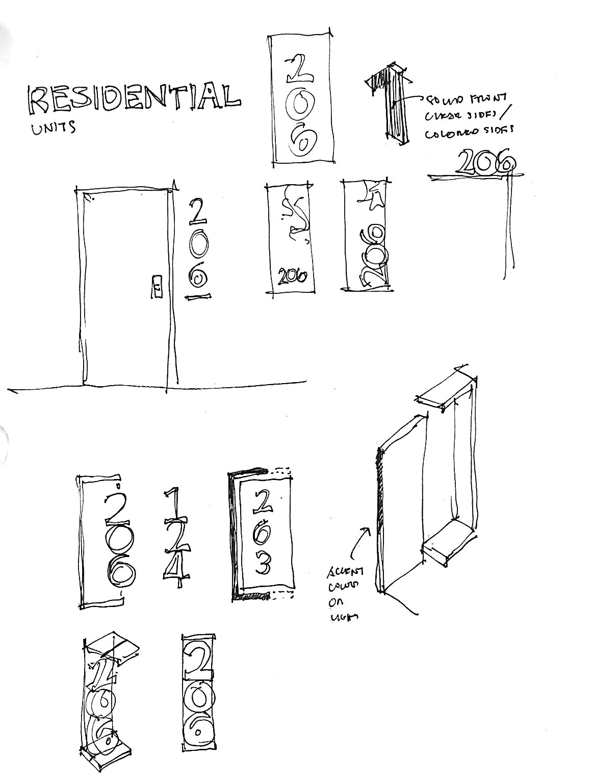
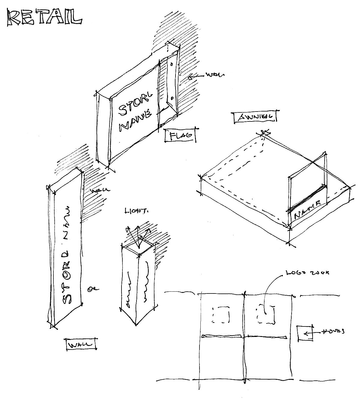
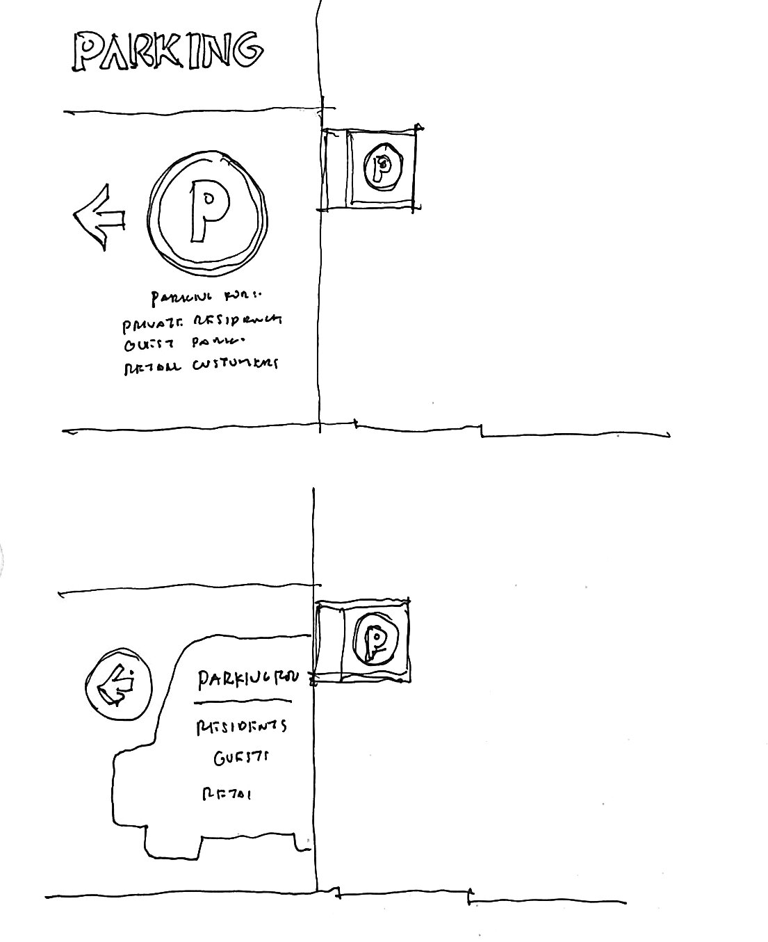
The Tenor Building Wayfinding and Signage
The Tenor Building Wayfinding and Signage
Client: BentallGreenOak
Design Team: Gelare Danaie, David Schellinger, Suzan Mecitoglu, Kha Den De/ Lera, Ramin Beyraghdar
Location: Toronto, ON
Project Completion: On-going
Vibrant and Dynamic – The Tenor is embarking on an exciting journey to enhance its signage and wayfinding experience!
Nestled in the bustling heart of Downtown Toronto, The Tenor attracts a substantial flow of visitors every day, necessitating a streamlined wayfinding system. DEXD was tasked to transform the wayfinding in the building to make it accessible and intuitive.
As a starting point, DEXD team has crafted a comprehensive Signage & Wayfinding Report, that investigated existing challenges and presented innovative solutions. The report commenced with a site analysis, during which the DEXD team conducted a site survey, created flow diagrams, and collected information and observations pertaining to navigation within the building. Subsequently, the team benchmarked projects of a similar nature and identified the most prominent wayfinding pain points present at The Tenor. By analyzing these pain points, DEXD identified opportunities for improvement and proposed the kit-of-parts approach for a tailored solution.
Following the initial report, the DEXD team developed and delivered a detailed design package based on the proposed kit-of-parts approach. The new wayfinding system has now been fully implemented at The Tenor, enhancing clarity, accessibility, and the overall visitor experience.

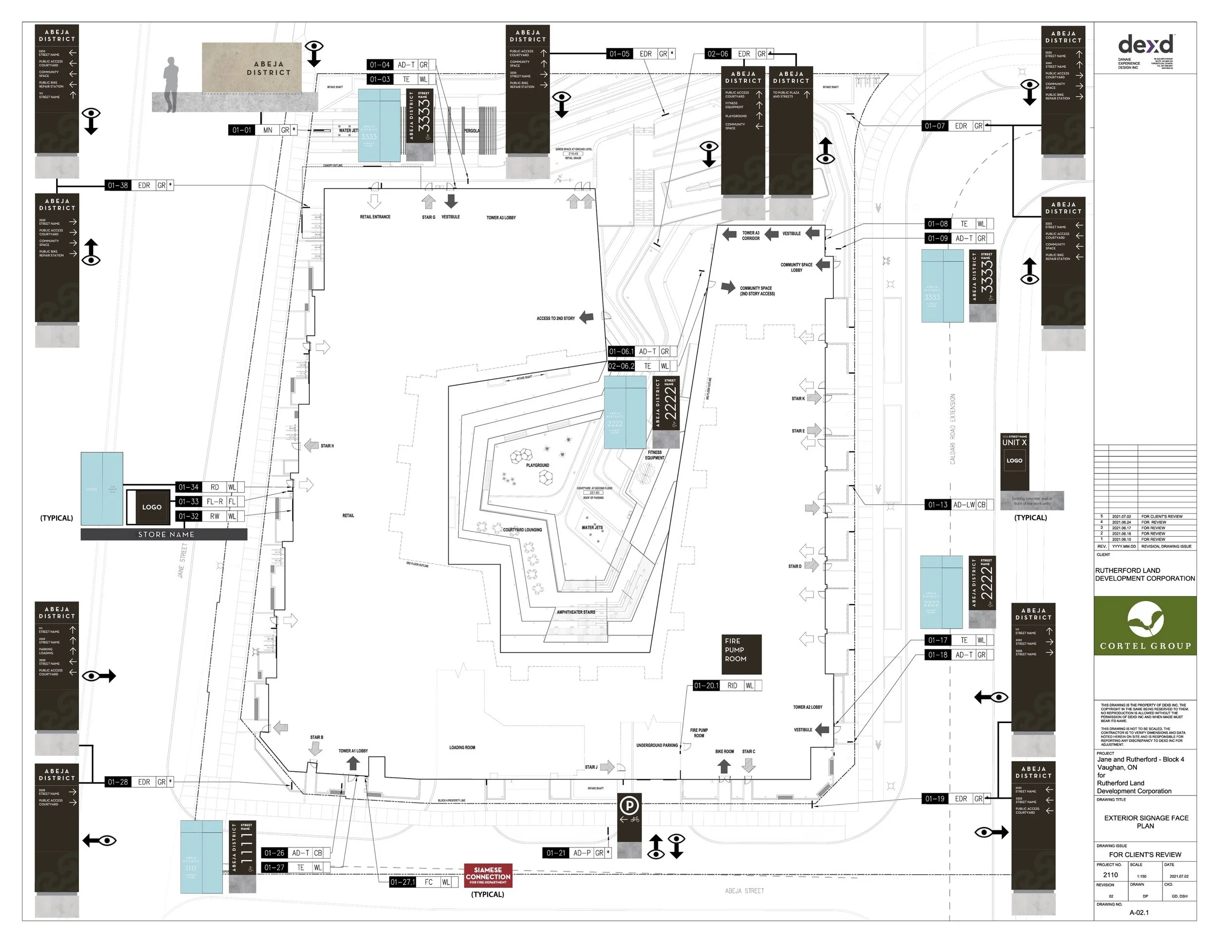
Abeja District Phase Four, Signage & Wayfinding
A master planned community like no other
Photo Courtesy of BDP Quadrangle
Abeja District Phase Four, Signage & Wayfinding
A master planned community like no other
Client: Cortel Group
Design Team: David Schellinger, Gelare Danaie, Daniel Puppin, Karen Zwart Hielema, Matt Ziyaee
Prime Architect: BDP Quadrangle
Project Completion: On-going
The Abeja District Project’s goal is to create a holistic, sustainable community. Located at Jane Street and Rutherford Road, this master-planned development is envisioned as a vibrant hub of life and activity, blending new condos, mixed-use, and commercial spaces into a dynamic urban fabric.
We began our work on the Abeja Wayfinding System for Block Four of the development with three towers, by looking to the larger planning context for the development, encompassing both the parcels under Cortel Group control as well as the surrounding city context.
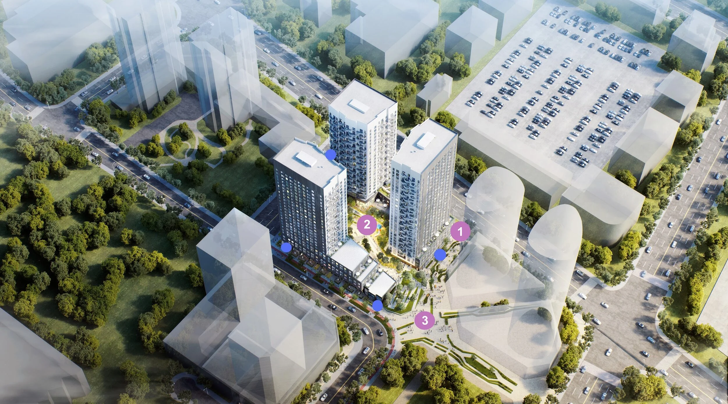
By documenting the expected master flow patterns for various types of users, we can better understand how people come to the site though public transportation or private vehicles, on foot or on bike. These flow patterns then help us to identify decision nodes, where different users and/or modes may come together, which would most benefit from having strong directional signage, branded experiences as well as public art.
Wayfinding Pyramid
We looked at the different routes that people would take to go between each of the nodes and how the wayfinding can be further enhanced through the views to nodes or the addition of signage elements. Lastly, we looked at the type of character that will be found in the collective spaces, to see where we can further enhance the character through branded environments that incorporate, architecture, landscape, signage, and public art all together. These places are identified as opportunities for what we are calling “placemaking”
1. Certainty (Identity and Code Signage)
2. Navigation (Directional Signage)
3. Delight (Monumental Signage, Branded Environments and Public Art)

Wayfinding and Brand
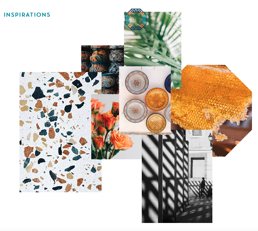
Abeja district block four is designed with a creative architectural theme which is simple, black with clean lines outside and playful light-colored with a beehive balcony looking inside. After a round of design collaboration meetings with the architects, landscape, and the project team, the decision was to keep the wayfinding graphic design as minimal, simple, and elegant as possible.
Our first design inspiration comes from the overall exterior look for the building, which is rendered in a darker monotone black/blue palate. As such, our signs work with a matte black color for the base of the exterior signs, with white illuminated messaging for increased legibility.
The exterior signs incorporate abstract elements of the Abeja logo in a tone-on-tone contrast to provide a subtle yet rich level of detail without compromising the elegant nature of the signs overall. For feature signs such as our monument sign along the public right of way, we drew inspiration from the Spanish heritage of the development by incorporating large slabs of Spanish Stone (or other similar stones) that are a signature building material of most Spanish architecture.

The interior design character of the building lobbies are rendered in a playful environment with a colorful and textured pallet. As such, our use of the base black signage works well to help stand out from the visual noise and provide clear focus on the directional messaging as much as possible.


Princess Hollywood Wayfinding
Princess Hollywood Wayfinding
Client: Cortel Group
Design Team: Gelare Danaie, David Schellinger, Suzan Mecitoglu
Prime Consultant: BDP Quadrangle
Location: Vaughan, ON
Project Completion: On-going
Welcome to the Princess Hollywood, a Signage and Wayfinding system for an exquisite development, designed to embrace community creation.
Located north of Highway 7, west of Creditstone Road, and south of Barnes Court, the complex is adjacent to a major transit hub and highway so that residents and visitors can enjoy convenience and accessibility.
To bring the project vision to life, DEXD team studied how various user types access the site. By understanding their arrival processes, we identified key areas where strategic placement of clear directional signage was required.
Mimicking the architectural design's vision
Drawing inspiration from the building's façade, we focused our design on framing the signs and taking cues from the strong grid structure of the building. The frames are strongly expressed and often offset from the sign face, allowing for a very clean and rectilinear look.
Wayfinding and Brand
Finally, we carefully considered physical signage elements like color, materials, typeface, and iconography, taking inspiration from the brand vision and architectural concept. To achieve a clean aesthetic, we opted for subtle colors that complement the raw and soft exterior concrete.
The use of faux wood, inspired by the wood timber beneath the portico, adds warmth and continuity to the design. Typeface and icons were also meticulously selected to show an elegant and sophisticated ambiance, aligning seamlessly with the building's overall identity and brand image.

Abeja District Phase 2 Wayfinding
Abeja District Phase 2 Wayfinding
Client: Cortel Group
Design Team: Gelare Danaie, David Schellinger, Alisson Talancha
Prime Consultant: Turner Fleischer Architects Inc.
Location: Vaughan, ON
Project Completion: On-going
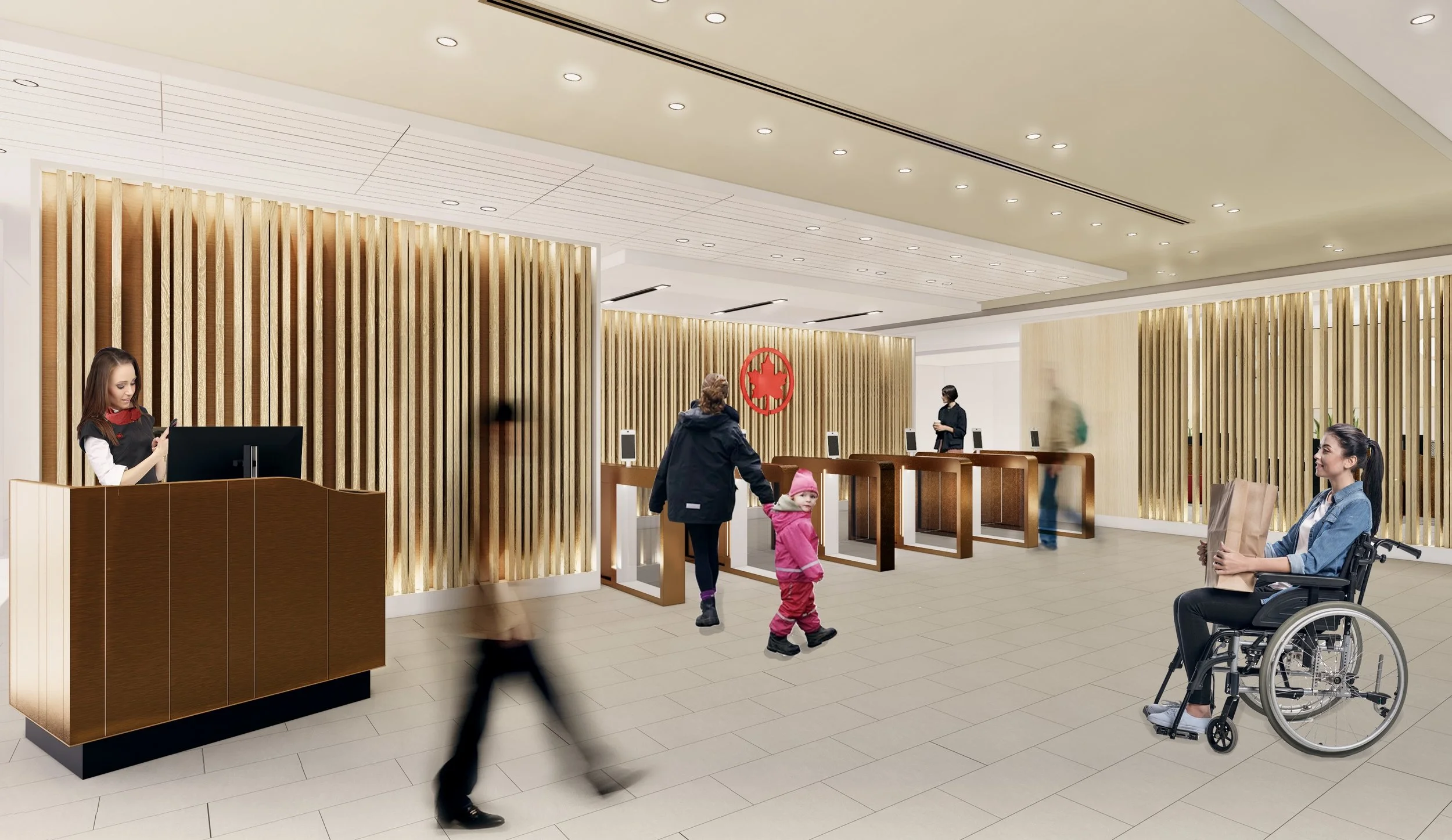
Air Canada Domestic Maple Leaf Lounge E-Gates
Air Canada Domestic Maple Leaf Lounge E-Gates
Client: Air Canada Corporate Real Estate (CRE)
Design Team: Gelare Danaie, Greg Parsons, Karen Zwart Hielema, Daniel Puppin, Ghazal Mehranpooy
Consultant Team:
Code: Elektra Vraches
Mechanical, Electrical, Communications: Quasar Engineering
Structure: Luciano Longo
Size: 1884 square feet
Project Completion: 2023
A focus on enhancing the customer journey through targeted enhancements has transformed the Air Canada Domestic Lounge entry sequence into a seamless and human-centric experience.
DEXD unique design approach uses journey mapping to understand customer profiles and needs. Targeted enhancements include the introduction of e-gates to streamline the entry process for lounge guests. Passengers with additional customer service needs are provided with an enhanced customer service desk experience where a more focused and personalized exchange can take place.
These additions create a more welcoming and inclusive environment, enhancing the overall customer experience as well attention paid to the Air Canada staff experience. Detailed design of the customer service agents’ spaces provides them with a comfortable and functional work environment to deliver exceptional assistance to travelers.

Atelier Park Wayfinding
Atelier Park Wayfinding
Client: Cortel Group
Design Team: Gelare Danaie, David Schellinger
Prime Consultant: IBI Group
Location: Vaughan, ON
Project Completion: On-going
The Atelier Park Signage & Wayfinding is a project that captures both graceful design and practical utility that create a smooth customer experience.
Located at the major intersection of Keele Street and Highway 7, Atelier Park is advantageously connected to VMC Subway Station (Vaughan Metropolitan Centre), GO Train line, bus routes, and even pedestrian walkways and green spaces, which outlines the need for clear wayfinding system that would provide clear directions for all users.
DEXD team began the work by producing flow diagrams and documenting expected master flow patterns, which then allowed us to identify decision nodes that would most benefit from having strong directional and/or branded signs, as well as identify best locations for address signs that would be easily pinpointed by users.
Architectural Patterning
As part of our design exploration, we looked into pattern expression and its storytelling potential.
Drawing inspiration from Atelier Park's brand vision that conceptualizes Atelier as designer's workshop or studio, we examined the idea of suit fashion, particularly referring to suit lining. Patterns we considered ranged from subtle but sophisticated to strong and bold-colored. The final design is inspired by the first building to be built within the proposed complex, and its angled faceted elements that run the height of the building facade.
Wayfinding and Brand
Although our design inspiration comes from the brand vision and architectural design, we built on the concept and proposed new colors that would pair nicely with initial brand palette. Typeface and icons were also meticulously selected to match overall elegant feeling of the building and brand.

CG Tower
Public art at the heart of the Vaughan Metropolitan Centre.
Expo City CG Tower Public Art
Photo courtesy of BDP Quadrangle
Client: Cortel Group
Design Team: Karen Zwart Hielema, Gelare Danaie, Daniel Puppin,
Prime Architect: BDP Quadrangle, DTAH Landscape Architect
Project Completion: On-going
Summer 2022
Artist Team Alan Tregebov and Joanne Heinen have been mentoring Kha Den De (Lera) during part of the design process for the new public artwork at CG Tower. were selected to provide a public artwork for the CG Tower site as part of the City of Vaughan Public Art Program. Previous works includes Street Light, and The Poet, The Fever Hospital together with the late artist Bernie Miller.
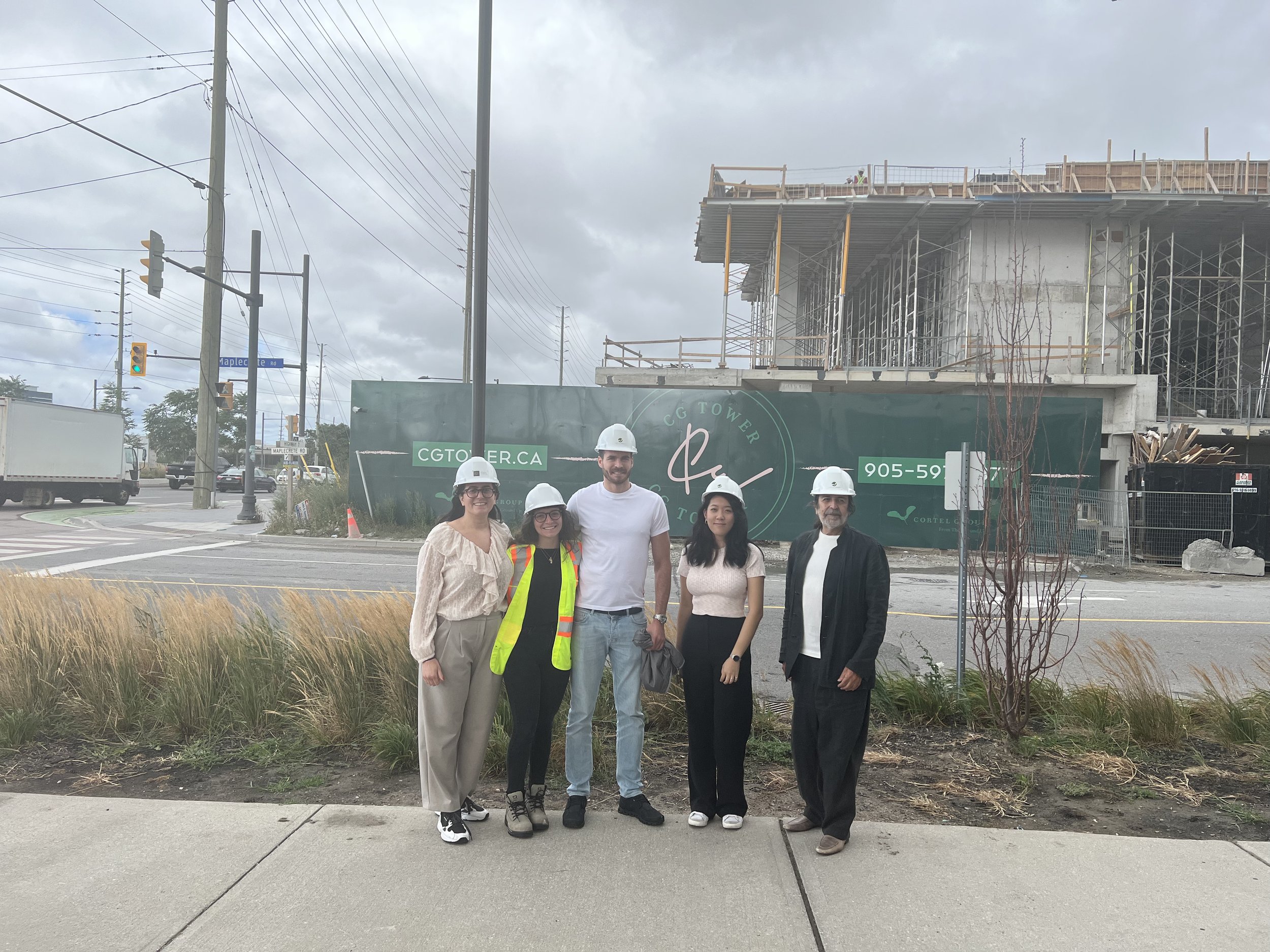
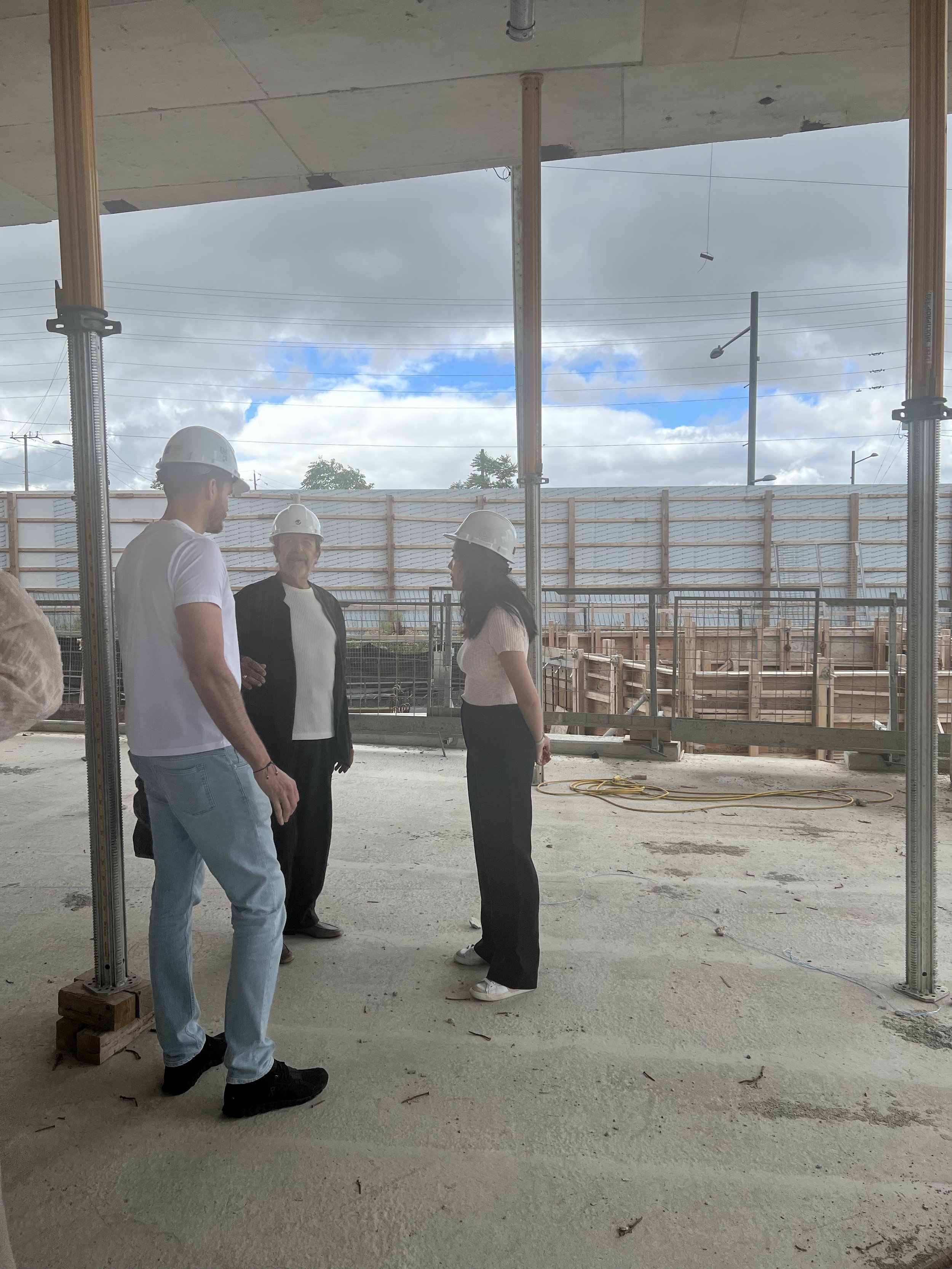
CG Tower main floor looking out to sculpture location. From l-r, Peter Cortelluci, (Cortel Group), Alan Tregebov (artist team), Lera (artist mentee)
Fall 2021
A new piece of public art is coming to the heart of the Vaughan Metropolitan Centre. Located near the intersection of Highway 7 and Jane Street, this piece will tell a story of transformation and speak to the unique identity and history of the Expo City neighbourhood. The artwork will be at CG Tower, the fifth and final element of Expo City by Cortel Group. The site overlooks Edgeley Pond and Park and provides an exceptional opportunity to elevate the public realm at a gateway entrance to the largest urban park for the new downtown. Stay tuned as this story unfolds!


Under Construction, Fall 2024

GTAA Landside Security Mitigation Signage and Wayfinding Project
GTAA Landside Security Mitigation Signage and Wayfinding Project
Client: GTAA Toronto Pearson
Prime Consultant: Arup Cananda Inc.

Sept-Iles Airport
Airport as a Community Space
Airport as Community Space - A Meeting Point Between Two Cultures
Project: Sept-IIes Airport - Sept-IIes, Quebec.
Client: Public Works and Governmental Services Canada (PWGSC)
Design Team: Gelare Danaie, Pedro Andrade, Matt Ziyaee
Consultant Team: Stantec Engineering
Size: 65,440 square feet (6,080 sqm)
Project Completion: 2019
With a change in passenger numbers and airline traffic, it was necessary for the Sept-Îles Airport to rethink the demands which resulted in infrastructure upgrades as well as improvements that enhanced the customer passenger experience. Operating on the northern shore of the St. Lawrence River, Sept-Îles Airport is located a short distance from the main city of Sept-Îles.
The city is home to over 25,000 residents, consisting of both a proud and growing Innu and European community. As a significant meeting point, these two distinct cultures formed the inspiration for the narrative of the design concept.
Critical to the vision of the project, was the importance of enhancing the customer experience along the journey. Developing intuitive wayfinding and implementing strategic decision making points were mapped along the entire customer journey for both arriving and departing passengers.
Each interaction along the customer journey, from check-in, baggage drop, security gates, baggage pickup, and curbside pickup were carefully explored with various stakeholders and user groups. For each step of the process, the goal was to create a clean and uncluttered environment where passengers are able to easily navigate their way, with clear sightlines and minimum use of textual language.
The reliance of merging infographics and art helped reinforce and convey the concept of a "meeting point between two cultures."
Supporting the airport requirements as a community and meeting destination, the team implemented a multifunctional hall on the second level for the purposes of hosting cultural events and community gatherings in a unique setting.
Other enhancements including fostering connections between the interior and exterior were explored, where access to daylight and views benefited a customer’s orientation and well-being. These improved connections created more opportunities for passengers to view the apron activity and beyond, creating unique and memorable experiences.

Air Canada Cargo
Branded Environments
Branded Environments
Project: Air Canada Cargo CHIP, Head Offices – Mississauga, Ontario
Client: Air Canada Corporate Real Estate (CRE)
Design Team: Gelare Danaie, Greg Parsons, Matt Ziyaee, and Pedro Andrade
Consultant Team: Quasar Engineering
Size: 43,227 square feet (4,016sqm)
Estimated Completion: In progress / 2021
The DEXD team was awarded to redesign the existing Air Canada Cargo CHIP head offices located at Toronto’s Pearson International Airport. Located on the third level of the main Air Canada Cargo building, the overarching goal was to consolidate and create an open and collaborative workplace environment with flexible meeting spaces maximizing efficiencies.
Early engagement sessions with our client and the various stakeholders included establishing and finalizing programming requirements, facilitating user group meetings, leading design charrettes, while managing project delivery and timelines. Early engagement with our Engineers was helpful in establishing extent of work and potential impacts to both schedule and construction budgets.
Several planning options including hybrids were presented for the purposes of generating discussion. Solutions included flexible social areas of collaboration, dedicated spaces for workshops /meetings, and quiet zones for those performing tasks requiring concentration.
Integral to the overall design experience, DEXD was given the opportunity to showcase and celebrate the history and future growth of the Cargo division and its valued employees.
Our approach to storytelling began by strategically implementing oversized graphics throughout the space, helping to convey our clients story to its stakeholders in the form of a meaningful and memorable experience. A simple, minimalistic approach was taken and where the brand was prioritized to have the greatest impact.